Have you checked your features distributions lately?

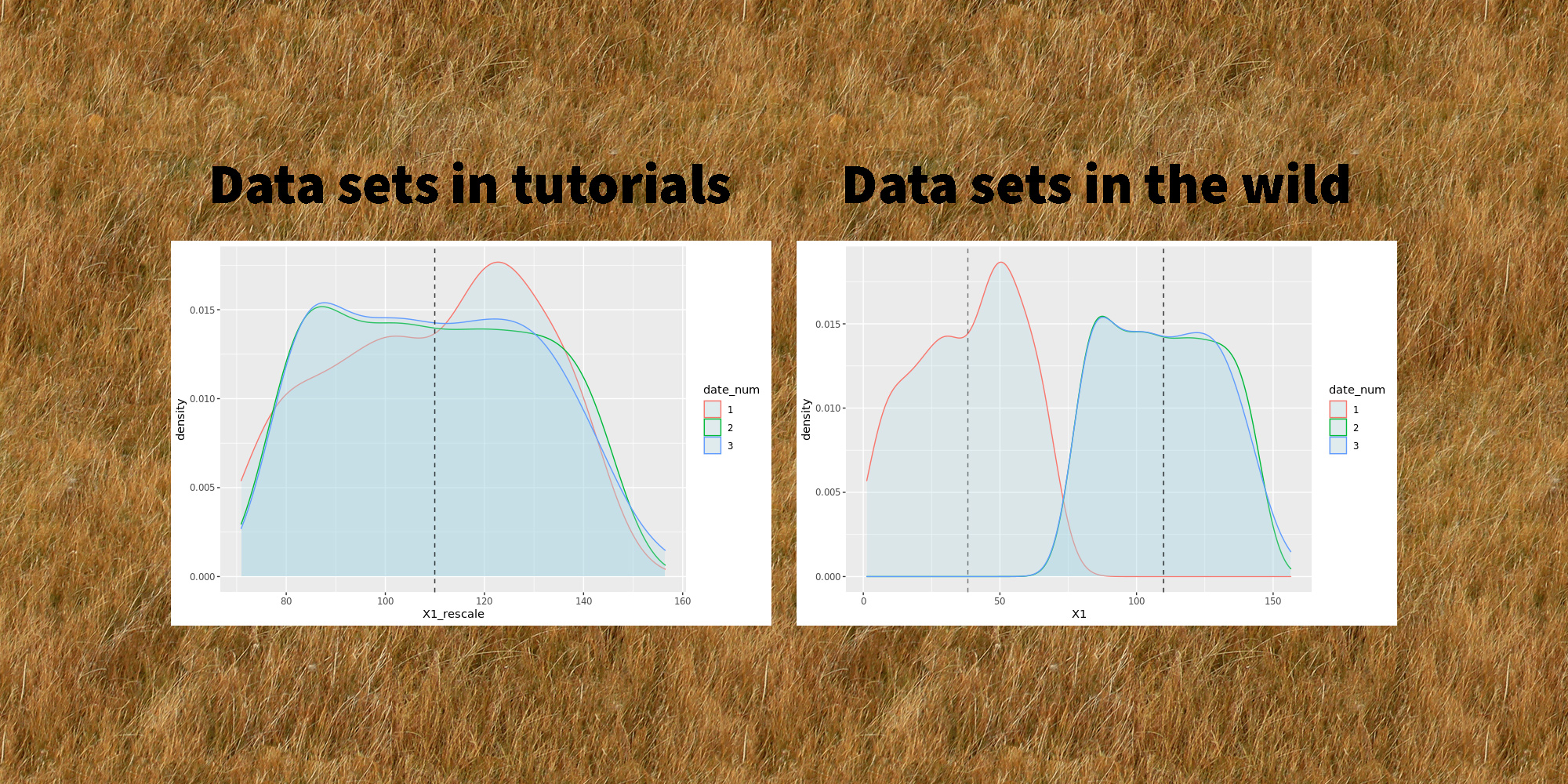
tl;dr 
Trying to debug a poorly performing machine learning model, I discovered that the distribution of one of the features varied from one date to another. I used a simple and neat affine rescaling. This simple quality improvement brought down the model’s prediction error by a factor 8

Data quality trumps any algorithm

I was recently working on a cool dataset that looked unusually friendly. It was tidy, neat, interesting… the kind of things that you rarely encounter in the wild! My goal was to build a super simple predictor for one of the features. However, I kept getting poor results and at first couldn’t figure out what was happening.

Data sets in tutorials are always cute, data sets in the wild are monstrous
Data sets in tutorials vs data sets in the wild. From Towards AI on Twitter

Here is the dataset I was working with. I tweaked the ids and dates, and muddied the variables a little to make sure I’m not leaking any critical info, but the gist of the problem is absolutely identical to what I was working with (i.e. it’s a real-world datasetTM, not a toy example).

library(tidyverse)
## Load data
data_magictransfo <- readRDS("data/nc233_rescaling_df_04_2021.rds")

This dataset features 211 distinct units and 3 main variables (X1, X2, Y) describing them. We have values for these variables on 7 consecutive dates.

> length(unique(data_magictransfo$unit_id))
[1] 211
> table(data_magictransfo$date_num)

  1   2   3   4   5   6   7 
204 211 211 211 211 211 211

Y is the variable we’re interested in predicting, and we’ll use X1 and X2 as predictors. Since this is basically a problem of machine learning on time series, we’ll use the last date as test set, and train our predictor on the first 6 dates. Usual stuff. To measure the accuracy, we will use the ratio between the square root of the MSE and the mean of the true variable for the 7th date:

df_train <- data_magictransfo %>%  filter(date_num <= 6)
df_test <- data_magictransfo %>%
  filter(date_num > 6)

pred_error_ratio <- function(predict_Y, true_Y) {
 
  mse_rescale <- (predict_Y - true_Y)**2
  mse_rescale <- mean(mse_rescale)
  pred_error_ratio <- sqrt(mse_rescale) / mean(true_Y)
 
  return(pred_error_ratio)
}

The first thing I tried was a super simple linear regression:

simple_model <- lm(Y ~ X1 + X2, data=df_train)
df_test$Y_predict_lm <- predict(simple_model, newdata = df_test)

pred_error_ratio_lm <- pred_error_ratio(df_test$Y_predict_lm, df_test$Y)
> pred_error_ratio_lm
[1] 0.3352261

This extra simple model gives a 33% error rate. Not catastrophic, but not great. Literature on this dataset suggests that 5% should be easily obtained though. Maybe the poor performance comes from the simplicity of the model? Let’s fire up some neural networks and see:

library(nnet)

set.seed(1005192119)
nn <- nnet(Y ~ X1+X2, data=df_train %>% select(Y,X1,X2)
             , size=11, decay=1.0e-5, maxit=5000, linout=T)

df_test$Y_predict_nn <- predict(nn, newdata=df_test %>% select(Y,X1,X2), type="raw")
prediction_error_ratio_nn <- pred_error_ratio(df_test$Y_predict_nn, df_test$Y)
> prediction_error_ratio_nn
[1] 0.1481201

Stop cutting corners and start doing what should always be done first: explore the data

¯\_(ツ)_/¯ Definitely far from what I expected. At this point, I should probably stop cutting corners and start doing what should always be done first: explore the data. After a few summaries, I start suspecting that X1 hides a dirty little secret:

density_plot1 <- ggplot(df_train, aes(x=X1, color=date_num)) +  
  geom_density(fill="lightblue", alpha=0.25) +
  NULL
print(density_plot1)
Distribution (density plot) of X1 by date. We see that X1 is clearly sampled from a different distribution for dates 1 and 2
Distribution of X1 by date. X1 is clearly sampled from a different distribution for dates 1 and 2. All dates after 3 show identical distributions

It seems like the distribution of X1 is different between dates 1, 2 and the rest of the dataset! 😱 Let’s zoom in on the first three dates and add vertical dashed lines for the average of X1 by date:

# Add averages to viz
moments_df <- df_train %>%
  filter(date_num <= 3) %>%
  group_by(date_num) %>%
  summarize(mu = mean(X1), sd = sd(X1))
mu_vec <- moments_df$mu

density_plot3 <- ggplot(df_train %>% filter(date_num <= 3), aes(x=X1, color=date_num)) +
  geom_density(fill="lightblue", alpha=0.25) +
  geom_vline(xintercept=mu_vec, linetype="dashed", color="black", alpha=0.5) +
  NULL
print(density_plot3)
Distribution of X1 for dates 1, 2 and 3
Distribution of X1 for dates 1, 2 and 3. Shapes are different for all three dates but averages for dates 2 and 3 are identical

Clearly, X1 for date 1 is a wildly different thing than other dates. At date 2, the distribution is closer to what it will be in the future: average is very close, but there is still a clear difference in the shape and the width of the tails.

As a data scientist, it’s your job to investigate the data-generating process 🕵️

This problem of features having different distributions by date (or by any other grouping than time, which could very well be possible as well) is common and can arise for multiple reasons. As a data scientist, it’s your job to investigate the data-generating process 🕵️ In this case, X1 comes from a score a certain authority attributes to each unit. A quick investigation revealed that the scoring method used had changed between dates 1 and 2, and then another time between dates 2 and 3. The change only affected the score and not the rank of the units, which means a simple fix should do 🙌

Now that we’ve diagnosed the problem, let’s try and fix it! Let’s open the math toolbox and… No, don’t go away! I promise it will be simple! 😂 The simplest tool in the box will suffice at first. We’ll try a rescaling of the form:

\( Z = a X_1 + b \)


The expected value and variance of this new variable are easy to compute using well-know formulae:

\( E(Z) = a E(X_1) + b \\ Var(Z) = a^2 Var(X_1) \)


We want the rescaled variable Z to have the same average and variance as the distribution from date 3 onwards. Let’s denote them μ and σ2. We thus have:

\( \mu = a \cdot E(X_1) + b \\ \sigma^2 = a^2 \cdot Var(X_1) \)


Since we know E(X1) and Var(X1) from the data, this is actually a very simple linear system with two variables (a and b) and two equations. The unique solution is:

\( a = \frac{\sigma}{Var(X_1)}\\ b = \mu ~ – ~ \frac{\sigma}{Var(X_1)} \cdot E(X_1) \)


which we can now apply on our data:

# Distribution parameters
library(zeallot) # Only used to improve code readability

moments2_df <- df_train %>% 
   mutate(date_select = case_when(
     date_num == "1" ~ "1",
     date_num == "2" ~ "2",
     date_num >= "3" ~ "3+",
     TRUE ~ "NA")
   ) %>% 
   select(date_select, X1) %>% 
   group_by(date_select) %>% 
   summarise(mu=mean(X1), sigma=sd(X1))

c(mu_1, mu_2, mu_Z) %<-% moments2_df$mu
c(sigma_1, sigma_2, sigma_Z) %<-% moments2_df$sigma
 
df_train <- df_train %>%
  mutate(X1_rescale = case_when(
    date_num == 1 ~ a1 * X1 + b1,
    date_num == 2 ~ a2 * X1 + b2,
    TRUE ~ X1
  ))

The new density plots look much better!

moments_df_rescale <- df_train %>%  filter(date_num <= 3) %>%
  group_by(date_num) %>%
  summarize(mu = mean(X1_rescale), sd = sd(X1_rescale))
mu_vec_rescale <- moments_df_rescale$mu

density_plot4 <- ggplot(df_train %>% filter(date_num <= 3), aes(x=X1_rescale, color=date_num)) +
  geom_density(fill="lightblue", alpha=0.25) +
  geom_vline(xintercept=mu_vec_rescale, linetype="dashed", color="black", alpha=0.5) +
  NULL
print(density_plot4)
Density plots of rescaled variables
Distribution (density) of rescaled X1 for dates 1, 2 and 3. The distributions are now centered on the same average and have same width

Now we can train our models on the rescaled data:

# New predictions
simple_model_rescale <- lm(Y ~ X1_rescale + X2, data=df_train)

df_test$X1_rescale <- df_test$X1
df_test$Y_predict_rescale <- predict(simple_model_rescale, newdata = df_test)
pred_error_ratio_rescale <- pred_error_ratio(df_test$Y_predict_rescale, df_test$Y)


set.seed(1005192119)
nn_check <- nnet(Y ~ X1_rescale+X2, data=df_train %>% select(Y,X1_rescale,X2)
           , size=13, decay=1.0e-5, maxit=5000, linout=T)

Y_predict_nn_check <- predict(nn_check, newdata=df_test %>% select(Y,X1_rescale,X2), type="raw")
prediction_error_ratio_nn_check <- pred_error_ratio(Y_predict_nn_check, df_test$Y)

The prediction errors go down by a lot! 🎉🎉🎉 8% for the linear model and 2.6% for the neural network:

> pred_error_ratio_rescale
[1] 0.08092733
> prediction_error_ratio_nn_check
[1] 0.02650212

As always, data quality trumps any algorithm, as powerful as it may be!
And lesson learned for me: never trust a cute-looking dataset. Data in the wild is always hard to tame.


To be continued…


Do you like data science and would be interested in building products that help entrepreneurs around the world start and grow their businesses? Shopify is hiring 2021 engineers and data scientists worldwide! Feel free to reach out if you’d like to know more 🙂