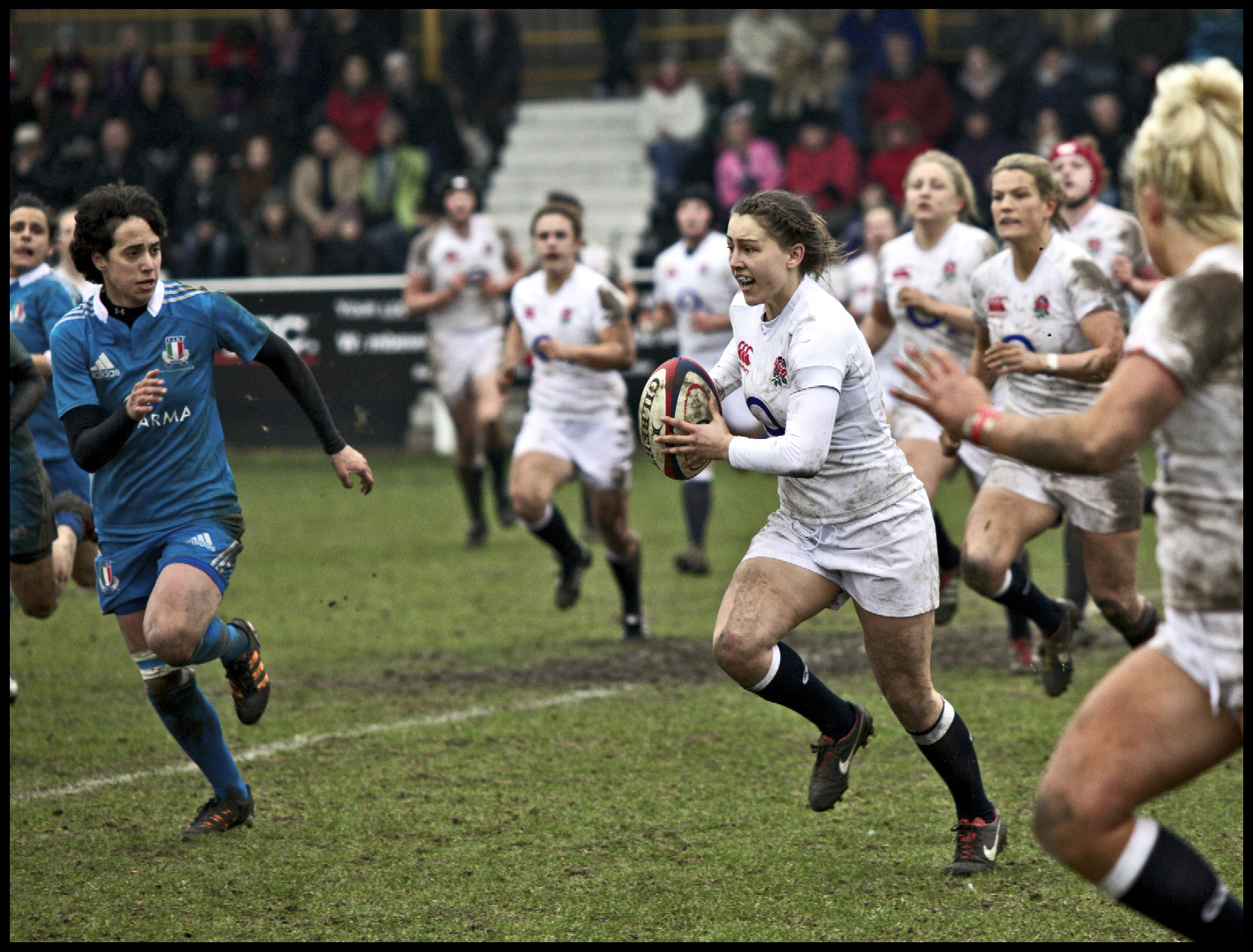
Rugby World Cup explainer using data

Last week, a stereotypical “French” ceremony opened the 10th Rugby World Cup in Stade de France, in the suburbs of Paris, France. As a small boy growing up in the southern half of France, I developed a strong interest for the sport. Now being an adult living and working in North America, where barely anyone has ever heard the word “Rugby”, I now rarely have anyone else to talk to about Antoine Dupont’s (captain of the French team and best Player in the world in 2021) prowess. Despite being very aware of this reality, I still wasn’t expecting the confused looks on my teammates faces when I casually brought up that I was excited for the World Cup to start during a Friday team meeting. I quickly stopped, before anyone asked more, all too aware that the confusion would only get worse if I had to start saying out loud scores like this 82-8 Ireland blowout or this 32-26 nail-biter involving Wales and Fiji.

From Rugby Noise. I have to admit that those numbers could look confusing at first

If you squinted at those numbers, keep reading! Sure, those might sound weird at first, but experiencing actions like this score is worth it! In this quick article, I’ll try to give you some explanations and comparisons to other sports grounded in data. Hopefully, in just a few minutes, you’ll be able to join in rugby gossip. And as a bonus, maybe you’ll learn a few things about data analytics in R along the way?

Countries having participated in at least one Rugby World Cup, from Wikipedia

Descriptive data on games scores

First things first, if you don’t know how points are scored in Rugby, I recommend you take a look at this guide. Now, about the data. I have access to a dataset of all International games played between the 19th Century and 2020. Since both how the game is played and how points are scored changed a lot throughout the years, I restricted my dataset to games played since 1995 (close to 1,500 games total). The data and the code are available on GitHub. We can start with some descriptive statistics about scores. Our dataset contains offense, which is the number of points scored by the home team, and diff, the difference with their opponents points (so a negative number means the away team was victorious, and vice versa).

library(tidyverse)
df_sports_with_rugby <- readRDS("df_sports_with_rugby.rds")
desc_stats <- df_sports_with_rugby %>%
  group_by(sport) %>%
  summarize(avg_offense = mean(offense)
        	, med_offense = median(offense)
        	, sd_offense = sd(offense)
        	, avg_diff = mean(diff)
        	, med_diff = median(diff)
        	, sd_diff = sd(diff)
        	) %>%
  arrange(avg_offense %>% desc)
desc_stats
sportavg_offensemed_offensesd_offenseavg_diffmed_diff
basketball102.6510210.982.573.0
rugby33.593016.006.866.0
football27.212708.042.482.5
hockey3.7741.430.271.0
soccer2.0721.330.501.0

As expected, basketball is the sport with the highest average and median winning scores. Rugby and football are fairly close to each other in that regard… which could give the impression that the score will look similar (Spoiler alert: they’re not!). Finally, standard deviations are not necessarily easy to read at first glance, but we immediately spot that despite having an average winner’s points 4 times below basketball’s, it’s standard deviation is higher. And Rugby is also an outlier in score difference. It has actually the highest average, median and standard deviation for diff. So clearly Rugby games are not expected to be close! Highest-level basketball and football on the other hand have an average score difference of just 2.5 points, which is below what you can get in just one action. This hints at very close games with exciting money time… so American! Finally, hockey and soccer have the lowest scores, and their average and median difference is also less than a goal.

One thing that I’d like you to notice is the difference between median and average scores (first two columns of the table above). The two numbers are extremely close for all sports… except Rugby. This suggests that something specific is happening at the tail of the distribution. To get confirmation, we can look at two additional metrics that give us more information about said tail. Skewness, when positive, indicates that accumulation is stronger above the median (below if negative). Kurtosis compares the size of the tail to that of the normal distribution: positive if the tail is larger and negative if lower. A large tail indicates that extreme events (in this case high total points scored) are more likely to happen compared to a variable whose distribution is normal.
In order to compute these two statistics in R, we’ll need the help of another package:

library(e1071)
tail_stats <- df_sports_with_rugby %>%
  group_by(sport) %>%
  summarize( skew_offense = skewness(offense)
        	, kurtosis_offense = kurtosis(offense)
        	, skew_diff = skewness(abs(diff))
        	, kurtosis_diff = kurtosis(abs(diff))
  ) %>%
  arrange(kurtosis_offense)
tail_stats
sportskew_offensekurtosis_offenseskew_diff
football0.14-0.151.26
basketball0.250.361.45
hockey0.460.401.18
soccer0.941.441.24
rugby1.785.502.01

Unsurprisingly, Rugby scores the highest in skewness and kurtosis for total points and point difference. All the other results are very interesting, and a little counter-intuitive. I would not have guessed that soccer would be second to last in that list ordered by tail size, with higher skewness and kurtosis for points and difference than hockey. However, finding football and basketball at the top only confirms the “American” bias towards close games. We can even notice that the Kurtosis of points scored in American football is negative, which makes it a “platykurtic” distribution. In other terms, we’d get a slightly wider total scores table if we simulated football scores from a normal distribution compared to reality. Finally, all the skewnesses of diff are positive. This means a clear accumulation on the positive side of the curve, which is where the home team prevails. In other terms, our 5 sports show signs of home field advantage. Neat.
We can also use ggplot2 to visualize these distributions, for example the home team score (offense):

adjust_offense <- 3 ## Visual factor to adjust smoothness of density
plot_distributions_offense <- ggplot(data=df_sports_with_rugby) +
  geom_density(alpha=0.3, aes(x=offense, fill=sport), adjust=adjust_offense) +
  # scale_x_log10() +
  scale_colour_gradient() +
  labs(x = 'Home team points', y='Density'
   	, title = 'Density plots of home team points') +
  theme_bw() +
  NULL
print(plot_distributions_offense)

An interesting thing to plot is to focus specifically on football, and compare with a simulated normal distribution, which will show in dashed lines:

football_avg <- desc_stats[desc_stats$sport == 'football',]$avg_offense
football_sd <- desc_stats[desc_stats$sport == 'football',]$sd_offense
adjust_football <- 1.5
plot_distributions_offense_football <- ggplot(data=df_sports_with_rugby %>%
                                   	filter(sport == 'football')) +
  geom_density(alpha=0.3, aes(x=offense, fill=sport), adjust=adjust_football) +
  # scale_x_log10() +
  scale_colour_gradient() +
  labs(x = 'Home team points', y='Density'
   	, title = 'Density plots of home team points') +
  theme_bw() +
  geom_density(data=tibble(t=1:10000, x=rnorm(10000, football_avg, football_sd))
         	,aes(x=x), alpha=0.6, linetype='longdash', adjust=2) +
  NULL
print(plot_distributions_offense_football)

Notice how the distribution peaks higher than normal, and then (at least on the left side), plunges to 0 more quickly than the dashed line? This is negative kurtosis visualized for you. The left and right sides being on different sides of the dashed lines: this one is the positive skewness we noticed a few paragraphs ago.

Converting scores in other sports equivalents

A few years ago, we created a scores converter app, which used comparisons between distributions to propose “equivalent scores” in different sports. Using my new Rugby dataset, all I had to do was add it to the app, and voila… we are now able to play with the app with Rugby and “translate” some of the confusing first round scores I mentioned in my opening paragraph into other sports in which we might be more fluent:

Equivalent scores for Wales-Fiji (32-26)
Equivalent scores for Ireland – Romania (82-8)
Equivalent scores for France – New Zealand (27-13)

I’ll try to keep updating the new scores conversions as the World Cup progresses in our Mastodon and my personal (brand new) Threads. If you have any questions or just want to say hi, feel free to reach out there as well. Happy Rugby World Cup!

Using R to build predictions for UEFA Euro 2020

Last friday, Euro 2020, one of the biggest events in International soccer, was kicked off by the inaugural match between Italy and Turkey (Italy won it 3-0). Euros (short for European Championships) are usually held every 4 years, but because of he-who-must-not-be-named, last year’s edition was postponed to this summer, while keeping the name “Euro 2020” (much like the Tokyo Olympics). 4 5 years ago, for Euro 2016, I basically wanted to try some cool methods based on splines on a real-world example. The model ended up doing fairly well, and most importantly it was a lot of fun, so we decided to do it again this year! The model, from training to the web app, is entirely built in R.

Click on this image to access the predictions!

How it works

The model is built on about 12.500 international football matches played since 2006. The main part actually consists in a combination of two models, one that predicts the number of goals scored by the reference team in a given game, the other one that predicts the number of goals they will allow. This basically models offense and defense for each team. A number of models for soccer have used similar ideas in the past, including FiveThirtyEight’s brilliant Soccer Power Index.

The features that are taken into account in the main models are:

  • Date
  • Indicator of home field advantage
  • Teams skills
  • Tournament importance (ex: Friendly Game rated as 1, Euro or World Cup Game rated as 8, etc.)
  • Confederation of opponent
  • Indicator showing if team is in list of “special playstyles” (compsition of the list is selected to maximize prediction accuracy)
  • Interaction term skill difference x tournament importance

Unfortunately the model does not take into account player-level data. For example, the absence of Milan AC’s superstar Zlatan Ibrahimovic is not taken into account in Sweden’s odds to win it all. Another great improvement could come from using expected goals instead of directly scored goals. The idea is that scored goals are a very small sample in soccer, so there’s much more signal in xG. Unfortunately, computing these expected goals requires play-by-play data, which I don’t have access to.

“I tried a lot of different methods, but none were able to beat my baseline set up with a simple linear regression”

As for the choice of the algorithm, although we had good success last time with splines, I also wanted to try various algorithms from the ML world in order to get the best possible results. In the end, I tried a lot of different methods, but none were able to beat my baseline set up with a simple polynomial regression. Perhaps unsurprisingly to many data science practitioners, linear regression wins again!

"The virgin non-parametric regression vs. The Chad linear regression"
“The virgin non-parametric regression vs. The Chad linear regression” – meme taken from Reddit

This first part of the prediction pipeline returns a double (see image below), which unfortunately we can’t directly use to create meaningful probabilities for the outcomes we’re interested in (group stage games, group rankings, teams final rankings).

Example of number goals predicted by the polynomial regression: results are floats, not integers

In order to get something useful, we have to resort to simulations. Simulations are really necessary in this case since a lot of non-linear factors can influence the final results: group composition, a somewhat convoluted qualifying system, etc. To me these “nonlinearities” are the fun part though! For this reason, we’ll update predictions after each day so that readers who are into this stuff can see how match results affect the likelihood of the global outcomes.

So, how do we transform a floating-point predicted number of goals into simulations? We start by using the predicted goals as parameter of a Poisson distribution. This generates all possible scores for each individual game and assigns a probability to each score. Then for each game we select at random one of the possible outcomes. This selection is done with unequal probabilities: the probability for each outcome to be selected corresponds to the probability indicated by the Poisson model (basically you don’t want to end with as many 8-3s as 1-0s in your simulations!). This is done through functions available in the excellent package sampling (see illustration below).

Screencap of the `draw_onesim` function, which uses sampling::UPsystematic to select an outcome at random with unequal probabilities
The main function used to select game outcomes at random according to probabilities generated by the Poisson process. It uses the method UPsystematic from the sampling package

And then… we repeat the process. 10.000 times, Monte-Carlo style. With a little help from the great package foreach for easy parallelization of the computations. And voila, by counting and averaging the simulated results, we get probabilities for each match, each team occupying each rank in their group, and for each team to reach each stage in the second round. 😊

A small statistical twist

The Poisson distribution is often used in simulations for sports predictions, and it is generally a great tool to use. However, the raw results present flaws that can come bite you if you don’t pay attention. For example, the Poisson tends to generate far fewer draws than expected (11% less in our case, to be precise). In order to account for this, we used one of my favorite tricks: weight calibration (implemented in the package Icarus). Basically, the idea is to modify the probabilities given by the Poisson distribution so that they match a certain pre-known result. There are infinite many ways to go about this, so weight calibration chooses the result that minimizes the distance to the initial probabilities. One of the other benefits of using this method is that we can calibrate on many probabilities at the same time, which we eventually did for:

  • Total number of goals scored per match and average
  • Share of draws
  • Among draws, share of 1-1s, 2-2s and draws with more than 6 goals
  • Share of draws in matches with “small” difference between teams skills
  • Share of draws in matches with “large” difference between teams skills
Output from the calibration process given by the Icarus package

Model selection and results

In order to select the best possible model, we ran a whole lot of tests and hyperparameter selection scripts. The main metrics for the selection process were prediction accuracy and the Brier score, which represents the quality of the estimated probabilities. Despite the simplicity of the model, the accuracy of the overall prediction is ~61% +/- 2% (both on the test set and in Cross-Validation), which is in line with most other soccer models. The 3-dimensional Brier score is 0.57 +/- 1%.

We get a clear trio of favorites: Belgium, France, and England. Although the first two are ranked 1st and 2nd in the FIFA rankings, England is probably favored because they’ll have home turf advantage for most of the second round. (But then as Dr Sean Elvidge writes, home turf advantage could be very relative this year ¯_(ツ)_/¯). It’s also interesting to see that leading soccer nations like Germany or Italy are not ranked favorably by our model, contrary to some others. I’m not totally sure I understand why btw, so feel free to let me know in the comments or on Twitter if you think you have an explanation!

Do you like data science and would be interested in building products that help entrepreneurs around the world start and grow their businesses? Shopify is hiring 2021 engineers and data scientists worldwide! Feel free to reach out if you’d like to know more 🙂

Featured image: Logo UEFA Euro 2020, © UEFA

Have you checked your features distributions lately?

tl;dr 
Trying to debug a poorly performing machine learning model, I discovered that the distribution of one of the features varied from one date to another. I used a simple and neat affine rescaling. This simple quality improvement brought down the model’s prediction error by a factor 8

Data quality trumps any algorithm

I was recently working on a cool dataset that looked unusually friendly. It was tidy, neat, interesting… the kind of things that you rarely encounter in the wild! My goal was to build a super simple predictor for one of the features. However, I kept getting poor results and at first couldn’t figure out what was happening.

Data sets in tutorials are always cute, data sets in the wild are monstrous
Data sets in tutorials vs data sets in the wild. From Towards AI on Twitter

Here is the dataset I was working with. I tweaked the ids and dates, and muddied the variables a little to make sure I’m not leaking any critical info, but the gist of the problem is absolutely identical to what I was working with (i.e. it’s a real-world datasetTM, not a toy example).

library(tidyverse)
## Load data
data_magictransfo <- readRDS("data/nc233_rescaling_df_04_2021.rds")

This dataset features 211 distinct units and 3 main variables (X1, X2, Y) describing them. We have values for these variables on 7 consecutive dates.

> length(unique(data_magictransfo$unit_id))
[1] 211
> table(data_magictransfo$date_num)

  1   2   3   4   5   6   7 
204 211 211 211 211 211 211

Y is the variable we’re interested in predicting, and we’ll use X1 and X2 as predictors. Since this is basically a problem of machine learning on time series, we’ll use the last date as test set, and train our predictor on the first 6 dates. Usual stuff. To measure the accuracy, we will use the ratio between the square root of the MSE and the mean of the true variable for the 7th date:

df_train <- data_magictransfo %>%  filter(date_num <= 6)
df_test <- data_magictransfo %>%
  filter(date_num > 6)

pred_error_ratio <- function(predict_Y, true_Y) {
 
  mse_rescale <- (predict_Y - true_Y)**2
  mse_rescale <- mean(mse_rescale)
  pred_error_ratio <- sqrt(mse_rescale) / mean(true_Y)
 
  return(pred_error_ratio)
}

The first thing I tried was a super simple linear regression:

simple_model <- lm(Y ~ X1 + X2, data=df_train)
df_test$Y_predict_lm <- predict(simple_model, newdata = df_test)

pred_error_ratio_lm <- pred_error_ratio(df_test$Y_predict_lm, df_test$Y)
> pred_error_ratio_lm
[1] 0.3352261

This extra simple model gives a 33% error rate. Not catastrophic, but not great. Literature on this dataset suggests that 5% should be easily obtained though. Maybe the poor performance comes from the simplicity of the model? Let’s fire up some neural networks and see:

library(nnet)

set.seed(1005192119)
nn <- nnet(Y ~ X1+X2, data=df_train %>% select(Y,X1,X2)
             , size=11, decay=1.0e-5, maxit=5000, linout=T)

df_test$Y_predict_nn <- predict(nn, newdata=df_test %>% select(Y,X1,X2), type="raw")
prediction_error_ratio_nn <- pred_error_ratio(df_test$Y_predict_nn, df_test$Y)
> prediction_error_ratio_nn
[1] 0.1481201

Stop cutting corners and start doing what should always be done first: explore the data

¯\_(ツ)_/¯ Definitely far from what I expected. At this point, I should probably stop cutting corners and start doing what should always be done first: explore the data. After a few summaries, I start suspecting that X1 hides a dirty little secret:

density_plot1 <- ggplot(df_train, aes(x=X1, color=date_num)) +  
  geom_density(fill="lightblue", alpha=0.25) +
  NULL
print(density_plot1)
Distribution (density plot) of X1 by date. We see that X1 is clearly sampled from a different distribution for dates 1 and 2
Distribution of X1 by date. X1 is clearly sampled from a different distribution for dates 1 and 2. All dates after 3 show identical distributions

It seems like the distribution of X1 is different between dates 1, 2 and the rest of the dataset! 😱 Let’s zoom in on the first three dates and add vertical dashed lines for the average of X1 by date:

# Add averages to viz
moments_df <- df_train %>%
  filter(date_num <= 3) %>%
  group_by(date_num) %>%
  summarize(mu = mean(X1), sd = sd(X1))
mu_vec <- moments_df$mu

density_plot3 <- ggplot(df_train %>% filter(date_num <= 3), aes(x=X1, color=date_num)) +
  geom_density(fill="lightblue", alpha=0.25) +
  geom_vline(xintercept=mu_vec, linetype="dashed", color="black", alpha=0.5) +
  NULL
print(density_plot3)
Distribution of X1 for dates 1, 2 and 3
Distribution of X1 for dates 1, 2 and 3. Shapes are different for all three dates but averages for dates 2 and 3 are identical

Clearly, X1 for date 1 is a wildly different thing than other dates. At date 2, the distribution is closer to what it will be in the future: average is very close, but there is still a clear difference in the shape and the width of the tails.

As a data scientist, it’s your job to investigate the data-generating process 🕵️

This problem of features having different distributions by date (or by any other grouping than time, which could very well be possible as well) is common and can arise for multiple reasons. As a data scientist, it’s your job to investigate the data-generating process 🕵️ In this case, X1 comes from a score a certain authority attributes to each unit. A quick investigation revealed that the scoring method used had changed between dates 1 and 2, and then another time between dates 2 and 3. The change only affected the score and not the rank of the units, which means a simple fix should do 🙌

Now that we’ve diagnosed the problem, let’s try and fix it! Let’s open the math toolbox and… No, don’t go away! I promise it will be simple! 😂 The simplest tool in the box will suffice at first. We’ll try a rescaling of the form:

\( Z = a X_1 + b \)


The expected value and variance of this new variable are easy to compute using well-know formulae:

\( E(Z) = a E(X_1) + b \\ Var(Z) = a^2 Var(X_1) \)


We want the rescaled variable Z to have the same average and variance as the distribution from date 3 onwards. Let’s denote them μ and σ2. We thus have:

\( \mu = a \cdot E(X_1) + b \\ \sigma^2 = a^2 \cdot Var(X_1) \)


Since we know E(X1) and Var(X1) from the data, this is actually a very simple linear system with two variables (a and b) and two equations. The unique solution is:

\( a = \frac{\sigma}{Var(X_1)}\\ b = \mu ~ – ~ \frac{\sigma}{Var(X_1)} \cdot E(X_1) \)


which we can now apply on our data:

# Distribution parameters
library(zeallot) # Only used to improve code readability

moments2_df <- df_train %>% 
   mutate(date_select = case_when(
     date_num == "1" ~ "1",
     date_num == "2" ~ "2",
     date_num >= "3" ~ "3+",
     TRUE ~ "NA")
   ) %>% 
   select(date_select, X1) %>% 
   group_by(date_select) %>% 
   summarise(mu=mean(X1), sigma=sd(X1))

c(mu_1, mu_2, mu_Z) %<-% moments2_df$mu
c(sigma_1, sigma_2, sigma_Z) %<-% moments2_df$sigma
 
df_train <- df_train %>%
  mutate(X1_rescale = case_when(
    date_num == 1 ~ a1 * X1 + b1,
    date_num == 2 ~ a2 * X1 + b2,
    TRUE ~ X1
  ))

The new density plots look much better!

moments_df_rescale <- df_train %>%  filter(date_num <= 3) %>%
  group_by(date_num) %>%
  summarize(mu = mean(X1_rescale), sd = sd(X1_rescale))
mu_vec_rescale <- moments_df_rescale$mu

density_plot4 <- ggplot(df_train %>% filter(date_num <= 3), aes(x=X1_rescale, color=date_num)) +
  geom_density(fill="lightblue", alpha=0.25) +
  geom_vline(xintercept=mu_vec_rescale, linetype="dashed", color="black", alpha=0.5) +
  NULL
print(density_plot4)
Density plots of rescaled variables
Distribution (density) of rescaled X1 for dates 1, 2 and 3. The distributions are now centered on the same average and have same width

Now we can train our models on the rescaled data:

# New predictions
simple_model_rescale <- lm(Y ~ X1_rescale + X2, data=df_train)

df_test$X1_rescale <- df_test$X1
df_test$Y_predict_rescale <- predict(simple_model_rescale, newdata = df_test)
pred_error_ratio_rescale <- pred_error_ratio(df_test$Y_predict_rescale, df_test$Y)


set.seed(1005192119)
nn_check <- nnet(Y ~ X1_rescale+X2, data=df_train %>% select(Y,X1_rescale,X2)
           , size=13, decay=1.0e-5, maxit=5000, linout=T)

Y_predict_nn_check <- predict(nn_check, newdata=df_test %>% select(Y,X1_rescale,X2), type="raw")
prediction_error_ratio_nn_check <- pred_error_ratio(Y_predict_nn_check, df_test$Y)

The prediction errors go down by a lot! 🎉🎉🎉 8% for the linear model and 2.6% for the neural network:

> pred_error_ratio_rescale
[1] 0.08092733
> prediction_error_ratio_nn_check
[1] 0.02650212

As always, data quality trumps any algorithm, as powerful as it may be!
And lesson learned for me: never trust a cute-looking dataset. Data in the wild is always hard to tame.


To be continued…


Do you like data science and would be interested in building products that help entrepreneurs around the world start and grow their businesses? Shopify is hiring 2021 engineers and data scientists worldwide! Feel free to reach out if you’d like to know more 🙂

Creating an hex map of France electricity consumption

The French Ministry for the Ecological and Inclusive Transition (for which I’m currently working) is ongoing a process of opening data related to energy consumption. Each year, we publish data for every neighborhood in France (at the iris statistical level, even adresses in some cases) and to the nature of the final consumer (a household, an industry, a shop…). These data are available here (website in French – direct link to 2018 electricity consumption data).

Making a map to have an overlook at the situation isn’t easy, because the administrative boundaries of France are very diverse, and a direct mapping will reflect this situation. In order to overcome this issue, a solution is to use a different way to represent the country. In this post, we’re going to talk about hex map (as inspired by this website).

What’s a hex map? First, we need to talk about chloropleth maps; despite their unusual names, they’re perfectly common maps where each area is shaded or colored differently according to the values taking by a variable. They’re quite similar to maps such as this one showing which political party won an election on each voting district, but for continuous variable, and required a scale. To determine the color used for each area, we need to compute the average (or any statistical summary) of the values of every individual belonging in this area.

Hex map are entirely composed of hexagons (something perfectly suited for France!); they’re chloropleth maps, so each hexagon is colored depending on the values taking by a variable. The main difference is that the hexagon aren’t usual geographical areas so we need a way to attribute each value in our data set to one of the hexagons before calculating averages, and therefore colors.

In order to do that, we’re going to load some usual R-packages:

library(tidyverse)  
library(viridis)   
library(ggplot2)   
library(stringr)

Our objective will be to make an hex map of residential consumption of electricity in 2018. First, we need to import the data at iris level (doing this, we miss some of the electricity consumption only associated to larger geographical area, but it’s marginal); as the data is coded as strings with some missing values, we start by cleaning the data.

elec <- read.csv2("donnees_elec_iris_2018.csv",stringsAsFactors = F)
elec <- elec[elec$CONSO != "s" & elec$PDL != "s",] #"s" are missing values

# CONSO (electricity consumption) is coded with a french comma separator ; we need to substitute that and convert to numeric CONSO and PDL (number of  energy delivery points) 
elec$CONSO <- str_replace(elec$CONSO,",",".") 
elec$CONSO <- as.numeric(elec$CONSO)
elec$PDL <- as.numeric(elec$PDL)

# Select only residential sector
res <- elec[elec$CODE_GRAND_SECTEUR == "R",]

Each data point is then associated to the coordinates of the center of the neighborhood, using a iris shapefile (available here). The res dataset obtained looks like this:

  CODE_IRIS      CONSO  PDL     x    y
  100020000   843.8162  124 48.25 4.69
  100030000 10374.7166 1987 48.24 3.72
  100040000   679.8085   88 48.59 4.12
  100050000   769.8268  145 48.29 4.49
  100060000  7318.2055 1534 48.53 4.14
  100070000   429.9674   61 48.16 4.73
  100080000   343.1404   62 48.25 4.60
  100090000   262.1539   55 48.05 4.28
  100100000   140.5366   28 48.54 4.61
  100110000   700.1244  113 48.27 4.74

We’re using a ggplot2 environment to create our hex map. The aesthetics used are aes(x,y), the spatial coordinates. We begin by these line of code in order to use a simpler theme (as we’re creating a map, we don’t need any axis) and to specify the positions (longitude and latitude) we want to map.

c <- ggplot(res, aes(x, y))
c + 
xlim(-9, 12) +
ylim(40, 52) +   
theme_void() 

The main argument of the stat_summary_hex function we’re going to use is bins. This parameter allows us to choose how many hexagons will be displayed on the map; the more hexagon, the more small local variations are shown. For the other parameters, we specify aes(z = CONSO) as we want to color the hexagons in relation to the CONSO (Consumption in french) of the data points contained in this area. The fun = “sum” parameter means that the choice of the color of the hexagon depends on the total consumption inside. Lastly, we add a colour=”grey” parameter, which defines the color of every hexagon’s borders, because using white borders on my computer leads to some graphical artefacts (see here).

c <- ggplot(res, aes(x, y))
c +  stat_summary_hex(bins=40,aes(z = CONSO),fun = "sum", colour="grey") +
xlim(-9, 12) +
ylim(40, 52) +   
theme_void() 

We then define a scale (both numeric and in terms of colors) using the scale_fill_viridis function. In order to better see large differences, we use the trans=”log” option which means that transitions between colors are logarithmic and not arithmetic progressions. The breaks points used are 1 GWh, 10 GWh, 100 GWh and 1 TWh.

 c <- ggplot(res, aes(x, y))
c +  stat_summary_hex(bins=40,aes(z = CONSO),fun = "sum", colour="grey") +
xlim(-9, 12) +
ylim(40, 52) +   
theme_void() +
scale_fill_viridis(
 option="A",
 trans = "log", 
 breaks = c(0,1000,10000,100000,1000000,99999999999),
 name="Electricity Consumption", 
 guide = guide_legend(keyheight = unit(2.5, units = "mm"),      keywidth=unit(4, units = "mm"), 
label.position = "bottom", 
title.position = 'top', nrow=1) )  

Using the following code with bins = 80 results in this another map:

c <- ggplot(res, aes(x, y))
c +  stat_summary_hex(bins=80,aes(z = CONSO),fun = "sum", colour="grey") +
xlim(-9, 12) +
ylim(40, 52) +   
theme_void() +
scale_fill_viridis(
 option="A",
 trans = "log", 
 breaks = c(0,1000,10000,100000,1000000,99999999999),
 name="Electricity Consumption", 
 guide = guide_legend(keyheight = unit(2.5, units = "mm"),      keywidth=unit(4, units = "mm"), 
label.position = "bottom", 
title.position = 'top', nrow=1) )  

These map highlight the position of urban centers with high population density. A more useful information is the total electricity consumption per household (or, more accurately in this case, per energy delivery point, whose quantity per iris is PDL in the dataset), defined this way:

res$ElectricityPerHousehold <- res$CONSO/res$PDL

The code used to generate the map is slighty similar; the stat_summary_hex parameter are modified to aes(z = ElectricityPerHousehold) and fun=”mean”, and, scale_fill_viridis parameters are switched to option=”E” (leading to a new color scheme), new breakpoints of 2, 4, 6 and 8 GWh per household, and a new legend name.

 c <- ggplot(res, aes(x, y))
c +  stat_summary_hex(bins=80,aes(z = ElectricityPerHousehold),fun = "mean", colour="grey") +
xlim(-9, 12) +
ylim(40, 52) +   
theme_void() +
scale_fill_viridis(
 option="E",
 trans = "log", 
 breaks = c(0,2,4,6,8,10),
 name="Electricity Consumption per Household", 
 guide = guide_legend(keyheight = unit(2.5, units = "mm"),      keywidth=unit(4, units = "mm"), 
label.position = "bottom", 
title.position = 'top', nrow=1) )  

This map better hightlights places with large electricity consumptions; Paris and its suburbs are associated to lower consumptions per household, which contrasts with an unusually high total consumption, due to high population density. An high consumption per household is usually associated to electric heating and/or large houses, and parisian dwellings are mostly smaller flats.

Featured image: Electricity Converter Power, by ArtisticOperations

Causal Inference cheat sheet for data scientists

Being able to make causal claims is a key business value for any data science team, no matter their size.
Quick analytics (in other words, descriptive statistics) are the bread and butter of any good data analyst working on quick cycles with their product team to understand their users. But sometimes some important questions arise that need more precise answers. Business value sometimes means distinguishing what is true insights from what is incidental noise. Insights that will hold up versus temporary marketing material. In other terms causation.

When answering these questions, absolute rigour is required. Failing to understand key mechanisms could mean missing out on important findings, rolling out the wrong version of a product, and eventually costing your business millions of dollars, or crucial opportunities.
Ron Kohavi, former director of the experimentation team at Microsoft, has a famous example: changing the place where credit card offers were displayed on amazon.com generated millions in revenue for the company.

The tech industry has picked up on this trend in the last 6 years, making Causal Inference a hot topic in data science. Netflix, Microsoft and Google all have entire teams built around some variations of causal methods. Causal analysis is also (finally!) gaining a lot of traction in pure AI fields. Having an idea of what causal inference methods can do for you and for your business is thus becoming more and more important.

The causal inference levels of evidence ladder

Hence the causal inference ladder cheat sheet! Beyond the value for data scientists themselves, I’ve also had success in the past showing this slide to internal clients to explain how we were processing the data and making conclusions.

The “ladder” classification explains the level of proof each method will give you. The higher, the easier it will be to make sure the results from your methods are true results and reproducible – the downside is that the set-up for the experiment will be more complex. For example, setting up an A/B test typically requires a dedicated framework and engineering resources.
Methods further down the ladder will require less effort on the set-up (think: observational data), but more effort on the rigour of the analysis. Making sure your analysis has true findings and is not just commenting some noise (or worse, is plain wrong) is a process called robustness checks. It’s arguably the most important part of any causal analysis method. The further down on the ladder your method is, the more robustness checks I’ll require if I’m your reviewer 🙂

I also want to stress that methods on lower rungs are not less valuable – it’s almost the contrary! They are brilliant methods that allow use of observational data to make conclusions, and I would not be surprised if people like Susan Athey and Guido Imbens, who have made significant contributions to these methods in the last 10 years, were awarded the Nobel prize one of these days!

causal_cheat_sheet
The causal inference levels of evidence ladder – click on the image to enlarge it

Rung 1 – Scientific experiments

On the first rung of the ladder sit typical scientific experiments. The kind you were probably taught in middle or even elementary school. To explain how a scientific experiment should be conducted, my biology teacher had us take seeds from a box, divide them into two groups and plant them in two jars. The teacher insisted that we made the conditions in the two jars completely identical: same number of seeds, same moistening of the ground, etc.
The goal was to measure the effect of light on plant growth, so we put one of our jars near a window and locked the other one in a closet. Two weeks later, all our jars close to the window had nice little buds, while the ones we left in the closet barely had grown at all.
The exposure to light being the only difference between the two jars, the teacher explained, we were allowed to conclude that light deprivation caused plants to not grow.

Sounds simple enough? Well, this is basically the most rigorous you can be when you want to attribute cause. The bad news is that this methodology only applies when you have a certain level of control on both your treatment group (the one who receives light) and your control group (the one in the cupboard). Enough control at least that all conditions are strictly identical but the one parameter you’re experimenting with (light in this case). Obviously, this doesn’t apply in social sciences nor in data science.

Then why do I include it in this article you might ask? Well, basically because this is the reference method. All causal inference methods are in a way hacks designed to reproduce this simple methodology in conditions where you shouldn’t be able to make conclusions if you followed strictly the rules explained by your middle school teacher.

Rung 2 – Statistical Experiments (aka A/B tests)

Probably the most well-known causal inference method in tech: A/B tests, a.k.a Randomized Controlled Trials for our Biostatistics friends. The idea behind statistical experiments is to rely on randomness and sample size to mitigate the inability to put your treatment and control groups in the exact same conditions. Fundamental statistical theorems like the law of large numbers, the Central Limit theorem or Bayesian inference gives guarantees that this will work and a way to deduce estimates and their precision from the data you collect.

Arguably, an Experiments platform should be one of the first projects any Data Science team should invest in (once all the foundational levels are in place, of course). The impact of setting up an experiments culture in tech companies has been very well documented and has earned companies like Google, Amazon, Microsoft, etc. billions of dollars.

Of course, despite being pretty reliable on paper, A/B tests come with their own sets of caveats. This white paper by Ron Kohavi and other founding members of the Experiments Platform at Microsoft is very useful.

Rung 3 – Quasi-Experiments

As awesome as A/B tests (or RCTs) can be, in some situations they just can’t be performed. This might happen because of lack of tooling (a common case in tech is when a specific framework lacks the proper tools to set up an experiment super quickly and the test becomes counter-productive), ethical concerns, or just simply because you want to study some data ex-post. Fortunately for you if you’re in one of those situations, some methods exist to still be able to get causal estimates of a factor. In rung 3 we talk about the fascinating world of quasi-experiments (also called natural experiments).

A quasi-experiment is the situation when your treatment and control group are divided by a natural process that is not truly random but can be considered close enough to compute estimates. In practice, this means that you will have different methods that will correspond to different assumptions about how “close” you are to the A/B test situation. Among famous examples of natural experiments: using the Vietnam war draft lottery to estimate the impact of being a veteran on your earnings, or the border between New Jersey and Pennsylvania to study the effect of minimum wages on the economy.

Now let me give you a fair warning: when you start looking for quasi-experiments, you can quickly become obsessed by it and start thinking about clever data collection in improbable places… Now you can’t say you haven’t been warned 😜 I have more than a few friends who were lured into attracted by a career in econometrics for the sheer love of natural experiments.

Most popular methods in the world of quasi-experiments are: differences-in-differences (the most common one, according to Scott Cunnigham, author of the Causal Inference Mixtape), Regression Discontinuity Design, Matching, or Instrumental variables (which is an absolutely brilliant construct, but rarely useful in practice). If you’re able to observe (i.e. gather data) on all factors that explain how treatment and control are separated, then a simple linear regression including all factors will give good results.

Rung 4 – The world of counterfactuals

Finally, you will sometimes want to try to detect causal factors from data that is purely observational. A classic example in tech is estimating the effect of a new feature when no A/B test was done and you don’t have any kind of group that isn’t receiving the feature that you could use as a control:

Slightly adapted from CausalImpact‘s documentation

Maybe right new you’re thinking: wait… are you saying we can simply look at the data before and after and be allowed to make conclusions? Well, the trick is that often it isn’t that simple to make a rigorous analysis or even compute an estimate. The idea here is to create a model that will allow to compute a counterfactual control group. Counterfactual means “what would have happened hadn’t this feature existed”. If you have a model of your number of users that you have enough confidence in to make some robust predictions, then you basically have everything

There is a catch though. When using counterfactual methods, the quality of your prediction is key. Without getting too much into the technical details, this means that your model not only has to be accurate enough, but also needs to “understand” what underlying factors are driving what you currently observe. If a confounding factor that is independent from your newest rollout varies (economic climate for example), you do not want to attribute this change to your feature. Your model needs to understand this as well if you want to be able to make causal claims.

This is why robustness checks are so important when using counterfactuals. Some cool Causal Inference libraries like Microsoft’s doWhy do these checks automagically for you 😲 Sensitivity methods like the one implemented in the R package tipr can be also very useful to check some assumptions. Finally, how could I write a full article on causal inference without mentioning DAGs? They are a widely used tool to state your assumptions, especially in the case of rung 4 methods.

(Quick side note: right now with the unprecedented Covid-19 crisis, it’s likely that most prediction models used in various applications are way off. Obviously, those cannot be used for counterfactual causal analysis)

Technically speaking, rung 4 methods look really much like methods from rung 3, with some small tweaks. For example, synthetic diff-in-diff is a combination of diff-in-diff and matching. For time series data, CausalImpact is a very cool and well-known R package. causalTree is another interesting approach worth looking at. More generally, models carefully crafted with domain expertise and rigorously tested are the best tools to do Causal Inference with only counterfactual control groups.

Hope this cheat sheet will help you find the right method for your causal analyses and be impactful for your business! Let us know about your best #causalwins on our Twitter, or in the comments!

Micromorts – how much risk of death would you accept?

tl;dr
 – A 1% death risk is deceptively high
 – Micromorts (1/10000 th of a percent) are a useful scale to model death risks
 – Statistical models for human life use ligh-tailed distributions. High values are extremely rare

Today a short post that I had in my drafts for a long time. I didn’t expect that it would (unfortunately) be so relevant to today’s context.

Life is finite and all human activities are risky. Although we all face a certain (hopefully low) risk of dying each time we breathe, it’s not enough reason to prevent us from doing any activities and live isolated in bubbles. But exactly how much risk of dying is acceptable? How much risk on your own life would you be willing to accept?

Living in a bubble would be fun! – xkcd.com

Turns out most people, sometimes even trained scientists, are bad at estimating death risk probabilities. They often underestimate how bad even seemingly low probabilities of dying can turn out to be. During a dramatic time of my life where I cared for a child who became suddenly sick. The head surgeon told us she had an 85% chance of making it.
So maybe you’re thinking oh it wasn’t that bad! And I mean I understand, 85 is pretty close to 100, situation’s looking fairly good, right? 

I was terrified.

To put this number into perspective, imagine if all patients admitted faced such a risk. Let’s say doctors see 15 patients per hour, work 10 hours a day and that the department has 10 doctors. This represents approximately 35’000 patients per year, which seems to fit this UK data. With a 15% death rate, this department would have to deal with more than 5000 deaths over the course of the year, which is the number of people who died in the entire city of San Francisco in 2018! This is one death every 1 hour 40 minutes!

An activity with a 99% chance of survival would certainly kill you in less than a year

In fact, routine surgical procedures with risks greater than 5% are classified high risk. Even a 99% chance of survival doesn’t look so good. If you were enough of a daredevil to engage every day in an activity that exposes you to “only” 1% death probability, then you’d be almost certainly dead within a year.
(You can see this easily by using this easy rule of thumb: consider a random event occurring with probability p. Then there is a 95% chance that the event will occur in less than 3/p tries. In this case, this would be 3 / 0.01 = 300 days, which is less than a year)

Micromort – the right scale for death risks

As it turns out, percents are not the right risk scale to talk about death risks. Ronald A. Howard realized this in 1979 and created the notion of micromort. A micromort represents a one-in-a-million chance of dying. Wikipedia has a list of how much risk some activities expose you to:

A micromort is one in a million chance of dying – it is equivalent to tossing 20 coins and getting 20 heads

Wikipedia has a list of how much risk some activities expose you to:

One day alive at age 20 – 1 micromort
Skydiving (one jump) – 10 micromorts
One day alive at age 90 – 400 micromorts
Being infected by the Spanish flu – 30000 micromorts
An ascent to Mt Everest – 40000 micromorts

Using this scale, my child’s illness exposed her to 150000 micromorts… which suddenly looks much frightening, and a much more intuitive representation of the risk she was actually exposed to.
(Side note if you’re wondering: my kid is fine, and I am really grateful for this 🙏 Diane, if you ever read this you are the sunshine of my life! ❤️☀️)

If this starts feeling scary, don’t worry too much. A risk of one micromort is equivalent to tossing 20 coins and getting only heads. It’s pretty unlikely! The problem is that you’re playing this game every day, and that every once in a while you have to remove some coins. By the time you’re 50, you only have 17 coins left, by the time you’re 90, you only have 11 left.

Statistical models of death

A neat thing about Micromorts is that they also make a good and intuitive statistical model for age at death for humans. Let’s consider this very simple model based on the “game” described in the previous paragraph. Every day you play this game, with a certain risk of dying (for sake of simplicity, let’s forget about modelling childhood and only concentrate on adult life):

  • Between the ages of 20 and 80, the risk is Floor(age / 10) – 1 micromorts (for example all days of your 26th year, you face a 1 micromort risk, all days in you 63rd year, you face 5 micromorts)
  • At age 80, the risk jumps to 100 micromorts, and then each year you have to add 50 additional micromorts (which means 150 micromorts at age 81, 200 micromorts at age 82, etc.)

We can run a few simulations in R to see what life expectancy looks like with this simple model. First let’s define a vector of the risks that match the model we just described:

max_age <- 300
min_age <- 20
age_cut <- 80
risks1 <- rep(1:7, each=365*10)
risks2 <- rep(((age_cut : max_age) - age_cut) * 50 + 100, each=365)
risks <- c(risks1, risks2) / (1e6)

Then we can run a few simulations to get a vector of age at death for 10 000 people playing this “game”. Note that all simulated values use the vectorization capabilities of the function rbinom:

N <- length(risks)
N_sims <- 1e4

days_sims <- matrix(rbinom(N_sims*N, 1, risks), ncol = N_sims, byrow = F)

death_ages_days <- apply(days_sims, 2, function(x) { 
    day_death <- which.max(x) 
    if(day_death > 1) {
      return(day_death / 365 + min_age)
    } else {
      return(max_age)
    } 
  })

The mean and max age at death are:

> mean(death_ages_days)
[1] 84.9348
> max(death_ages_days)
[1] 103.0274

Not too far from what we observe in most Western countries! For example, life expectancy for Canadian women in 2018 was 84.3 years, and that same year, the oldest Canadian man alive was 109 years old.

We can plot the distribution of age at death:

library(ggplot2)

model_plot <- 
   ggplot(data.frame(age=death_ages_days)) +   
     geom_histogram(aes(x=age, y=..density..), fill="#4b86b4") + 
     geom_density(aes(x=age, y=..density..), colour="#2a4d69") +
     xlab("Age at death") +
     ylab("Frequency") +
     theme_bw()
 print(model_plot)

In addition to being close to the actual demographic values, the most interesting property of this model is that it was able to generate a light tailed distribution.

A light tail distribution is one that quickly falls down for the highest values. Contrary to statistical distributions like revenue where extreme values (i.e. values that are several standard deviations greater than the mean) are routinely observed, extreme values are very unlikely when it comes to human life. The oldest person we know of reached 122 years of age and people who make it past 100 years old are still a tiny minority. It is extremely unlikely that we would observe someone living to be 200 or even 150 years old.
Even a good old normal distribution would yield extreme values more often (a distribution is said to have “light” and “fat” tails if extreme values are less (resp. more) likely to happen than with a normal distribution). We can see this on this plot from a StackExchange post where life expectancy distribution is plotted against the best normal fit:

One of the best statistical distributions one can use to model human life is the Weibull distribution. It is a variant of the exponential distribution, that is often studied in high school and is typically used to model memory-less failures (i.e. a probability of failing that is independent of time). The Weibull distribution is very similar except the failure rate increases with time, mimicking an aging process. The statistical model I used for this article is in fact very close to how the Weibull distribution works.

Do you like data science and would be interested in building products that help entrepreneurs around the world start and grow their businesses? Shopify is hiring 🎉 for many locations in Canada 🇨🇦 and around the world 🌎! Feel free to reach out directly to me 🙂

Edit: A previous version of the article didn’t feature the tweet illustrating the simple death model, and had typos in two micromorts numbers that were corrected

The Mrs. White probability puzzle

tl;dr -I don’t remember how many games of Clue I’ve played but I do remember being surprised by Mrs White being the murderer in only 2 of those games. Can you give an estimate and an upper bound for the number of games I have played?
We solve this problem by using Bayes theorem and discussing the data generation mechanism, and illustrate the solution with R.

The characters in the original game of Clue. Mrs White is third from the left on the first row (and is now retired!)

Making use of external information with Bayes theorem

Having been raised a frequentist, I first tried to solve this using a max likelihood method, but quickly gave up when I realized how intractable it actually was, especially for the upper bound.
This is a problem where conditioning on external knowledge is key, so the most natural way to tackle it is to use Bayes theorem. This will directly yield an interpretable probability for what we’re looking for (most probable number of and uncertainty interval)
 
Denote an integer n>3 and:
Our notations for the problem
 
What we want writes as a simple product of quantities that we can compute, thanks to Bayes:
Bayes theorem gives us directly the probability we are looking for
Notice that there is an “proportional to” sign instead of an equal. This is because the denominator is just a normalization constant, which we can take care of easily after computing the likelihood and the prior.
Likelihood
The likelihood indicates the odds of us observing the data (in this case, that k_Mrs_White = 2) given the value of the unknown parameter (here the number of games played). Since at the beginning of each game the murderer is chosen at uniform random between 6 characters, the number of times Mrs White ends up being the culprit can be modeled as a binomial distribution with parameters n and 1/6.
 
This will be easily obtained using the dbinom function, which gives directly the exact value of P(x = k), for any x and a binomial distribution of parameters n and p. Let’s first import a few useful functions that I put in our GitHub repo to save some space on this post, and set a few useful parameters:
library(tidyverse)
source("clue/clue_functions.R")

## Parameters
k_mrs_white <- 2 # Number of times Mrs. White was the murderer
prob <- 1/6 # Probability of Mrs. White being the murderer for one game
Note that we can’t exactly obtain the distribution for any game from 1 to infinity, so we actually compute the distribution for 1 to 200 games (this doesn’t matter much in practice):
x <- 1:200 # Reduction of the problem to a finite number of games

## Likelihood
dlikelihood <- dbinom(k_mrs_white, x, prob)
easy enough 🙂
 
Side note: when I was a student, I kept forgetting that the distribution functions existed in R and whenever I needed them I used to re-generate them using the random generation function (rbinom in this case) 🤦‍♂️
Prior
There are a lot of possible choices for the prior but here I’m going to consider that I don’t have any real reason to believe and assume a uniform probability for any number of games between 3 and 200:
dprior1 <- dunifdisc(x,3,100)
plot_clue_prior(x, dprior1)
Uniform prior for all number of games between 3 and 100
First posterior
Using the likelihood and the prior, we can easily compute the posterior, normalize it and plot it:
dposterior1 <- dlikelihood * dprior1
dposterior1 <- dposterior1 / sum(dposterior1)
plot_clue_posterior(x, dposterior1)
Plot of the first posterior computed
We can also compute directly the estimates we’re looking for. The most probable number of games played is 11:
> which.max(dposterior1)
[1] 11
And there is a 95% chance that the number of games is less than 40:
> threshold_val <- 0.975
> which(cumsum(dposterior1) > (threshold_val))[1]
[1] 40

A more realistic data generation mechanism

I find this result very unsatisfying. It doesn’t “feel” right to me that someone would be surprised by only 2 occurrences of Mrs White being guilty in such a small number of games! For example, I simulated 40 games, a number that was supposedly suspiciously high according to the model:
set.seed(9)
N_sim_games <- 40
sim_murderer <- runifdisc(N_sim_games, 6)

plot_murderer <- ggplot(tibble(x=1:N_sim_games, y=sim_murderer), aes(y, stat(count))) +
  geom_histogram(aes(y =..count..),
                 bins=6, fill="white",colour="black") +
  ylab("Frequency - murderer") +
  xlab("Character #") +
  scale_x_continuous(breaks = 1:6)
print(plot_murderer)
Simulating 40 games of Clue. Character #4 and #5 were the murderer in respectively only 2 and 3 games
We observe that characters #4 and #5 are the murderers in respectively only 2 and 3 games!
 
In the end I think what really counts is not the likelihood that *Mrs White* was the murderer 2 times, but that the *minimum* number of times one of the characters was the culprit was 2 times!
 
I think it’s a cool example of a problem where just looking at the data available is not enough to make good inference – you also have to think about *how* the data was generated (in a way, it’s sort of a twist of the Monty Hall paradox, which is one of the most famous examples of problems where the data generation mechanism is critical to understand the result).
 
I wrote a quick and dirty function based on simulations to generate this likelihood, given a certain number of games. I saved the distribution directly in the GitHub (and called it Gumbel since it kinda looks like an extreme value problem) so that we can call it and do the same thing as above:
gumbelclue_2 <- readRDS("clue/dcluegumbel_2.rds")
gumbelclue_2 <- gumbelclue_2[x]

dposterior_gen <- gumbelclue_2 * dprior1
dposterior_gen <- dposterior_gen / sum(dposterior_gen)

plot_clue_posterior(x, dposterior_gen)
Posterior with the new data generation mechanism
The new posterior has the same shape but appears shifted to the right. For example N_games = 50 seems much more likely now! The estimates are now 23 for the number of games:
> which.max(dposterior_gen)
[1] 23
And 51 for the max bound of the uncertainty interval
> threshold_val <- 0.975
> which(cumsum(dposterior_gen) > (threshold_val))[1]
[1] 51

Credits for title image: Yeonsang

Ranking places with Google to create maps

Today we’re going to use the googleway R package, which allows their user to do requests to the GoogleMaps Places API. The goal is to create maps of specific places (restaurants, museums, etc.) with information from Google Maps rankings (number of stars given by other people). I already discussed this in french here to rank swimming pools in Paris. Let’s start by loading the three libraries I’m going to use : googleway, leaflet to create animated maps, and RColorBrewer for color ranges.

library(googleway)
library(leaflet)
library(RColorBrewer)

First things first. To do API request to Google, we need an API key ; you can ask for one here. We’ll use this key for the rest of the program, so let’s declare a global variable :

api_key <- "YourKeyHereIWontGiveYouMine"

Retrieving Google Data

We’re going to use the google_places function to get a list of places matching a description, called research in my program (for instance : “Restaurant, Paris, France”). The output are multiple, and I’m going to store the place ID and the rating. I’ll also store the research token ; that’ll be explained later.

gmaps_request <- google_places(search_string = research, language = language, key = api_key)
  gmaps_data <- gmaps_request$results
  
  place_id <- gmaps_data$place_id
  rating <- gmaps_data$rating
  
  token <- gmaps_request$next_page_token

This function returns up to 20 places associated to the research by Google. If you want more than 20, you need to use the token previously stored in order to ask the Google Places API to give you the next results, by tweaking the function this way :

gmaps_request <- google_places(search_string = research, language = language, key = api_key, page_token = token)

There are tow caveats to this function. Firstly, the token can be NULL. In this case, there isn’t any further research results you can get. This happens automatically as soon as you reach 60 results. Secondly, the API needs time to refresh the token research (see here) ; that’s why we’re going to make R wait a few seconds, using Sys.sleep(time) between our requests. Our complete function is therefore :

gmaps_request <- google_places(search_string = research, language = language, key = api_key)
  gmaps_data <- gmaps_request$results
  
  place_id <- gmaps_data$place_id
  rating <- gmaps_data$rating
  
token <- gmaps_request$next_page_token
Sys.sleep(5)
continue <- TRUE

  while (continue) {
    
    gmaps_request <- google_places(search_string = research, language = language, key = api_key, page_token = token)
    gmaps_data <- gmaps_request$results
    
    if (!is.null(gmaps_request$next_page_token)) {
      place_id = c(place_id,gmaps_data$place_id)
      rating = c(rating,gmaps_data$rating)
      token <- gmaps_request$next_page_token
      Sys.sleep(5)
    }
    else{continue <- FALSE}
  }

Now we’re going to search for the spatial coordinates of the places we found. To this extent, we’re going to use the google_place_details function of the packages, and retrieve latitude and longitude with these two functions :

get_lat <- function(id, key, language) {
  id <- as.character(id)
  details <- google_place_details(id, language = language, key=key)
  return(details$result$geometry$location$lat)
}

get_lng <- function(id, key, language) { 
  id <- as.character(id)
  details <- google_place_details(id, language = language, key=key)
  return(details$result$geometry$location$lng) 
}

All these blocks add up to build the complete function :

get_gmaps_data <- function(research, api_key, language) {
  
  gmaps_request <- google_places(search_string = research, language = language, key = api_key)
  gmaps_data <- gmaps_request$results
  
  place_id <- gmaps_data$place_id
  rating <- gmaps_data$rating
  
  token <- gmaps_request$next_page_token
  Sys.sleep(5)
  continue <- TRUE
  
  while (continue) {
    
    gmaps_request <- google_places(search_string = research, language = language, key = api_key, page_token = token)
    gmaps_data <- gmaps_request$results
    
    if (!is.null(gmaps_request$next_page_token)) {
      place_id <- c(place_id, gmaps_data$place_id)
      rating <- c(rating, gmaps_data$rating)
      token <- gmaps_request$next_page_token
      Sys.sleep(5)
    }
    else{continue <- FALSE}
  }
  
  lat = sapply(place_id, get_lat, key=api_key, language=language)
  lng = sapply(place_id, get_lng, key=api_key, language=language)
  
  return(data.frame(place_id, rating, lat, lng))
}

Map plot

The next part is more classical. We’re going to order the ratings of the data frame built by the previous function in order to arrange the places in differents groups. Each of the groups will be associated to a color on the data plot. If we want to make number_colors groups with the color scheme color (for instance, “Greens”), we are using the following instructions :

color_pal <- brewer.pal(number_colors, color)
pal <- colorFactor(color_pal, domain = seq(1,number_colors))

plot_data <- gmaps_data
plot_data$ranking <- ceiling(order(gmaps_data$rating)*number_colors/nrow(plot_data))

The definitive function just needs the addition of the leaflet call :

show_map <- function(number_colors, gmaps_data, color="Greens") {
  
color_pal <- brewer.pal(number_colors,color)
pal <- colorFactor(color_pal, domain = seq(1,number_colors))

plot_data <- gmaps_data
plot_data$ranking <- ceiling(order(gmaps_data$rating)*number_colors/nrow(plot_data)) leaflet(plot_data) %>% addTiles() %>%
  addCircleMarkers(
    radius = 6,
    fillColor = ~pal(ranking),
    stroke = FALSE, fillOpacity = 1
  ) %>% addProviderTiles(providers$CartoDB.Positron)
}

Examples

I just need to combine these two functions in one, and then to do some food-related examples !

maps_ranking_from_gmaps <- function(research, api_key, language, number_colors=5, color="Greens") {
  show_map(number_colors, get_gmaps_data(research, api_key, language), color)
}

maps_ranking_from_gmaps("Macaron, Paris, France", api_key, "fr")
maps_ranking_from_gmaps("Macaron, Montreal, Canada", api_key, "fr")

maps_ranking_from_gmaps("Poutine, Montreal, Canada", api_key, "fr", 5, "Blues")
maps_ranking_from_gmaps("Poutine, Paris, France", api_key, "fr", 5, "Blues")

which returns the following maps :

Macaron in Paris, France

Macaron in Montreal, Canada

Poutine in Montreal, Canada

Poutine in Paris, France (I guess French people are not ready for this)

Weighting tricks for machine learning with Icarus – Part 1

Calibration in survey sampling is a wonderful tool, and today I want to show you how we can use it in some Machine Learning applications, using the R package Icarus. And because ’tis the season, what better than a soccer dataset to illustrate this? The data and code are located on this gitlab repo: https://gitlab.com/haroine/weighting-ml

weighting ML gitlab
https://gitlab.com/haroine/weighting-ml

First, let’s start by installing and loading icarus and nnet, the two packages needed in this tutorial, from CRAN (if necessary):

install.packages(c("icarus","nnet"))
library(icarus)
library(nnet)

Then load the data:

load("data/weighting_ML_part1.RData")

The RData file contains two dataframes, one for the training set and one for the test set. They contain results of some international soccer games, from 01/2008 to 12/2016 for the training set, and from 01/2017 to 11/2017 for the test. Along with the team names and goals scored for each side, a few descriptive variables that we’re going to use as features of our ML models:

> head(train_soccer)
        Date                   team opponent_team home_field elo_team
1 2010-10-12                Belarus       Albania          1      554
2 2010-10-08 Bosnia and Herzegovina       Albania          0      544
3 2011-06-07 Bosnia and Herzegovina       Albania          0      594
4 2011-06-20              Argentina       Albania          1     1267
5 2011-08-10             Montenegro       Albania          0      915
6 2011-09-02                 France       Albania          0      918
  opponent_elo importance goals_for goals_against outcome year
1          502          1         2             0     WIN 2010
2          502          1         1             1    DRAW 2010
3          564          1         2             0     WIN 2011
4          564          1         4             0     WIN 2011
5          524          1         2             3    LOSS 2011
6          546          1         2             1     WIN 2011

elo_team and opponent_elo are quantitative variables indicative of the level of the team at the date of the game ; importance is a measure of high-profile the game played was (a friendly match rates 1 while a World Cup game rates 4). The other variables are imo self-descriptive.

Then we can train a multinomial logistic regression, with outcome being the predicted variable, and compute the predictions from the model:

outcome_model_unw <- multinom(outcome ~ elo_team + opponent_elo + home_field + importance,
data = train_soccer)

test_soccer$pred_outcome_unw <- predict(outcome_model_unw, newdata = test_soccer)

The sheer accuracy of this predictor is kinda good:

> ## Accuracy
> sum(test_soccer$pred_outcome_unw == test_soccer$outcome) / nrow(test_soccer)
[1] 0.5526316

but it has a problem: it never predicts draws!

> summary(test_soccer$pred_outcome_unw)
DRAW LOSS  WIN 
   0  208  210

And indeed, draws being less common than other results, it seems more profitable for the algorithm that optimizes accuracy never to predict them. As a consequence, the probabilities of the game being a draw is always lesser than the probability of one team winning it. We could show that the probabilities are not well calibrated.

A common solution to this problem is to use reweighting to correct the imbalances in the sample, which we’ll now tackle. It is important to note that the weighting trick has to happen in the training set to avoid “data leaks”. A very good piece on this subject has been written by Max Kuhn in the documentation of caret.

R package caret
https://topepo.github.io/caret/

Commonly, you would do:

train_soccer$weight <- 1
train_soccer[train_soccer$outcome == "DRAW",]$weight <- (nrow(train_soccer)/table(train_soccer$outcome)[1]) * 1/3
train_soccer[train_soccer$outcome == "LOSS",]$weight <- (nrow(train_soccer)/table(train_soccer$outcome)[2]) * 1/3
train_soccer[train_soccer$outcome == "WIN",]$weight <- (nrow(train_soccer)/table(train_soccer$outcome)[3]) * 1/3

> table(train_soccer$weight)

0.916067146282974  1.22435897435897 
             3336              1248

The draws are reweighted with a factor greater than 1 and the other games with a factor lesser than 1. This balances the predicted outcomes and thus improves the quality of the probabilities …

outcome_model <- multinom(outcome ~ elo_team + opponent_elo + home_field + importance,
data = train_soccer,
weights = train_soccer$weight)

test_soccer$pred_outcome <- predict(outcome_model, newdata = test_soccer)
> summary(test_soccer$pred_outcome)
DRAW LOSS  WIN 
  96  167  155

… though at a loss in accuracy:

> ## Accuracy
> sum(test_soccer$pred_outcome == test_soccer$outcome) / nrow(test_soccer)
[1] 0.5263158

Now let’s look at the balance of our training sample on other variables:

> round(table(test_soccer$importance) / nrow(test_soccer),2)

   1    2    3    4 
0.26 0.08 0.54 0.12 
> round(table(train_soccer$importance) / nrow(train_soccer),2)

   1    2    3    4 
0.56 0.08 0.23 0.12

It seems that the test set features a lot more important matches than the training set. Let’s look further, in particular at the dates the matches of the training set were played:

> round(table(train_soccer$year) / nrow(train_soccer),2)

2008 2009 2010 2011 2012 2013 2014 2015 2016 
0.10 0.11 0.11 0.10 0.11 0.13 0.11 0.11 0.12

Thus the matches of each year between 2008 and 2016 have the same influence on the final predictor. A better idea would be to give the most recent games a slightly higher influence, for example by increasing their weight and thus reducing the weights of the older games:

nyears <- length(unique(train_soccer$year))
year_tweak <- rep(1/nyears,nyears) * 1:nyears
year_tweak <- year_tweak * 1/sum(year_tweak) ## Normalization

> year_tweak
[1] 0.02222222 0.04444444 0.06666667 0.08888889 0.11111111 0.13333333
[7] 0.15555556 0.17777778 0.20000000

We determine it is thus a good idea to balance on these two additional variables (year and importance). Now how should we do this? A solution could be to create an indicator variable containing all the values of the cross product between the variables outcome, year and importance, and use the same reweighting technique as before. But this would not be very practical and more importantly, some of the sub-categories would be nearly empty, making the procedure not very robust. A better solution is to use survey sampling calibration and Icarus 🙂

train_soccer$weight_cal <- 1
importance_pct_test <- unname(
table(test_soccer$importance) / nrow(test_soccer),
)

marginMatrix <- matrix(, nrow = 0, ncol = 1) %>% ## Will be replaced by newMarginMatrix() in icarus 0.3.2
addMargin("outcome", c(0.333,0.333,0.333)) %>%
addMargin("importance", importance_pct_test) %>%
addMargin("year", year_tweak)

train_soccer$weight_cal <- calibration(data=train_soccer, marginMatrix=marginMatrix,
colWeights="weight_cal", pct=TRUE, description=TRUE,
popTotal = nrow(train_soccer), method="raking")

outcome_model_cal <- multinom(outcome ~ elo_team + opponent_elo + home_field + importance,
data = train_soccer,
weights = train_soccer$weight_cal)

test_soccer$pred_outcome_cal <- predict(outcome_model_cal, newdata = test_soccer)

icarus gives a summary of the calibration procedure in the log (too long to reproduce here). We then observe a slight improvement in accuracy compared to the previous reweighting technique:

> sum(test_soccer$pred_outcome_cal == test_soccer$outcome) / nrow(test_soccer)
[1] 0.5478469

But more importantly we have reason to believe that the we improved the quality of the probabilities assigned to each event (we could check this using metrics such as the Brier score or calibration plots) 🙂

It is also worth noting that some algorithms (especially those who rely on bagging, boosting, or more generally on ensemble methods) naturally do a good job at balancing samples. You could for example rerun the whole code and replace the logit regressions by boosted algorithms. You would then observe fewer differences between the unweighted algorithm and its weighted counterparts.

Stay tuned for the part 2, where we’ll show a trick to craft better probabilities (particularly for simulations) using external knowledge on probabilities.