Using R to build predictions for UEFA Euro 2020

Last friday, Euro 2020, one of the biggest events in International soccer, was kicked off by the inaugural match between Italy and Turkey (Italy won it 3-0). Euros (short for European Championships) are usually held every 4 years, but because of he-who-must-not-be-named, last year’s edition was postponed to this summer, while keeping the name “Euro 2020” (much like the Tokyo Olympics). 4 5 years ago, for Euro 2016, I basically wanted to try some cool methods based on splines on a real-world example. The model ended up doing fairly well, and most importantly it was a lot of fun, so we decided to do it again this year! The model, from training to the web app, is entirely built in R.

Click on this image to access the predictions!

How it works

The model is built on about 12.500 international football matches played since 2006. The main part actually consists in a combination of two models, one that predicts the number of goals scored by the reference team in a given game, the other one that predicts the number of goals they will allow. This basically models offense and defense for each team. A number of models for soccer have used similar ideas in the past, including FiveThirtyEight’s brilliant Soccer Power Index.

The features that are taken into account in the main models are:

  • Date
  • Indicator of home field advantage
  • Teams skills
  • Tournament importance (ex: Friendly Game rated as 1, Euro or World Cup Game rated as 8, etc.)
  • Confederation of opponent
  • Indicator showing if team is in list of “special playstyles” (compsition of the list is selected to maximize prediction accuracy)
  • Interaction term skill difference x tournament importance

Unfortunately the model does not take into account player-level data. For example, the absence of Milan AC’s superstar Zlatan Ibrahimovic is not taken into account in Sweden’s odds to win it all. Another great improvement could come from using expected goals instead of directly scored goals. The idea is that scored goals are a very small sample in soccer, so there’s much more signal in xG. Unfortunately, computing these expected goals requires play-by-play data, which I don’t have access to.

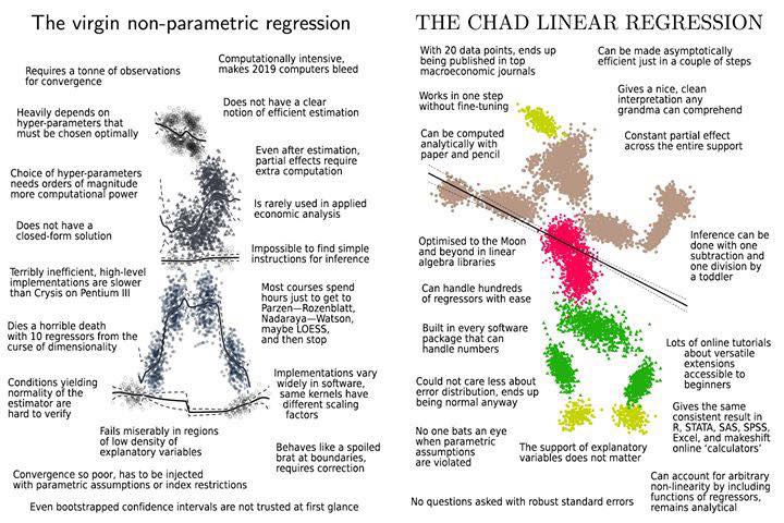
“I tried a lot of different methods, but none were able to beat my baseline set up with a simple linear regression”

As for the choice of the algorithm, although we had good success last time with splines, I also wanted to try various algorithms from the ML world in order to get the best possible results. In the end, I tried a lot of different methods, but none were able to beat my baseline set up with a simple polynomial regression. Perhaps unsurprisingly to many data science practitioners, linear regression wins again!

"The virgin non-parametric regression vs. The Chad linear regression"
“The virgin non-parametric regression vs. The Chad linear regression” – meme taken from Reddit

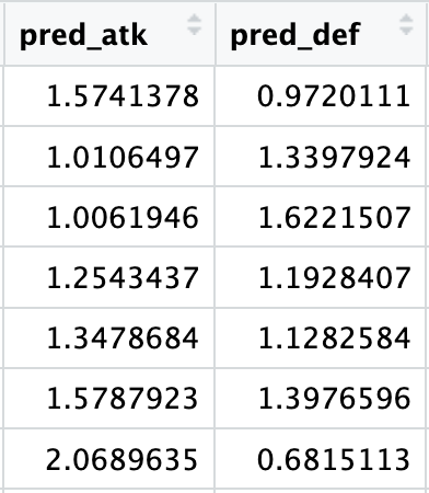
This first part of the prediction pipeline returns a double (see image below), which unfortunately we can’t directly use to create meaningful probabilities for the outcomes we’re interested in (group stage games, group rankings, teams final rankings).

Example of number goals predicted by the polynomial regression: results are floats, not integers

In order to get something useful, we have to resort to simulations. Simulations are really necessary in this case since a lot of non-linear factors can influence the final results: group composition, a somewhat convoluted qualifying system, etc. To me these “nonlinearities” are the fun part though! For this reason, we’ll update predictions after each day so that readers who are into this stuff can see how match results affect the likelihood of the global outcomes.

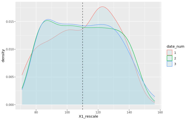
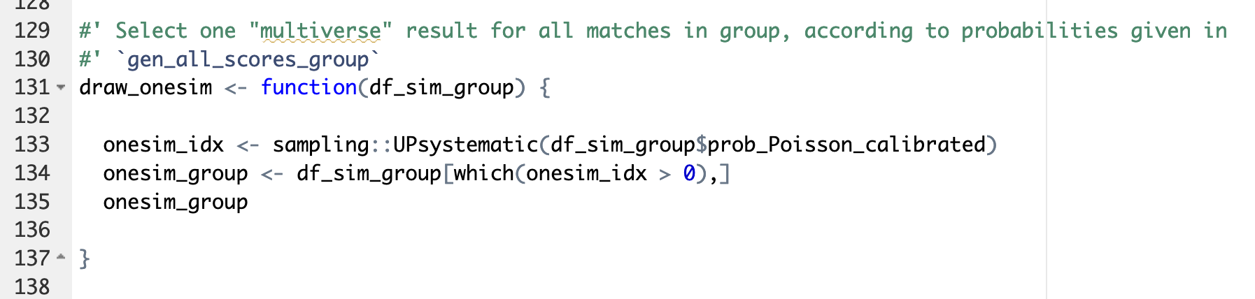
So, how do we transform a floating-point predicted number of goals into simulations? We start by using the predicted goals as parameter of a Poisson distribution. This generates all possible scores for each individual game and assigns a probability to each score. Then for each game we select at random one of the possible outcomes. This selection is done with unequal probabilities: the probability for each outcome to be selected corresponds to the probability indicated by the Poisson model (basically you don’t want to end with as many 8-3s as 1-0s in your simulations!). This is done through functions available in the excellent package sampling (see illustration below).

Screencap of the `draw_onesim` function, which uses sampling::UPsystematic to select an outcome at random with unequal probabilities
The main function used to select game outcomes at random according to probabilities generated by the Poisson process. It uses the method UPsystematic from the sampling package

And then… we repeat the process. 10.000 times, Monte-Carlo style. With a little help from the great package foreach for easy parallelization of the computations. And voila, by counting and averaging the simulated results, we get probabilities for each match, each team occupying each rank in their group, and for each team to reach each stage in the second round. 😊

A small statistical twist

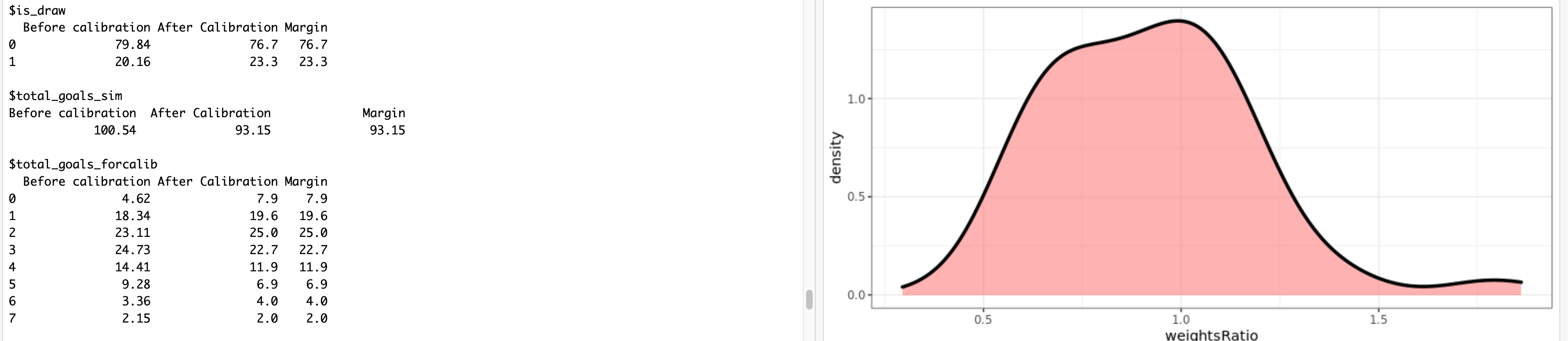
The Poisson distribution is often used in simulations for sports predictions, and it is generally a great tool to use. However, the raw results present flaws that can come bite you if you don’t pay attention. For example, the Poisson tends to generate far fewer draws than expected (11% less in our case, to be precise). In order to account for this, we used one of my favorite tricks: weight calibration (implemented in the package Icarus). Basically, the idea is to modify the probabilities given by the Poisson distribution so that they match a certain pre-known result. There are infinite many ways to go about this, so weight calibration chooses the result that minimizes the distance to the initial probabilities. One of the other benefits of using this method is that we can calibrate on many probabilities at the same time, which we eventually did for:

  • Total number of goals scored per match and average
  • Share of draws
  • Among draws, share of 1-1s, 2-2s and draws with more than 6 goals
  • Share of draws in matches with “small” difference between teams skills
  • Share of draws in matches with “large” difference between teams skills
Output from the calibration process given by the Icarus package

Model selection and results

In order to select the best possible model, we ran a whole lot of tests and hyperparameter selection scripts. The main metrics for the selection process were prediction accuracy and the Brier score, which represents the quality of the estimated probabilities. Despite the simplicity of the model, the accuracy of the overall prediction is ~61% +/- 2% (both on the test set and in Cross-Validation), which is in line with most other soccer models. The 3-dimensional Brier score is 0.57 +/- 1%.

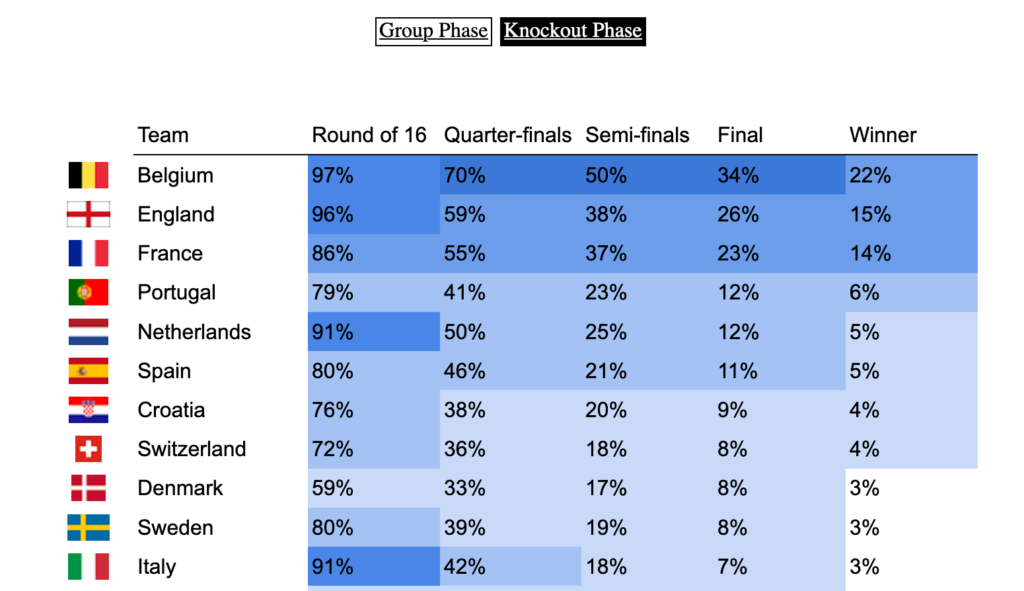
We get a clear trio of favorites: Belgium, France, and England. Although the first two are ranked 1st and 2nd in the FIFA rankings, England is probably favored because they’ll have home turf advantage for most of the second round. (But then as Dr Sean Elvidge writes, home turf advantage could be very relative this year ¯_(ツ)_/¯). It’s also interesting to see that leading soccer nations like Germany or Italy are not ranked favorably by our model, contrary to some others. I’m not totally sure I understand why btw, so feel free to let me know in the comments or on Twitter if you think you have an explanation!

Do you like data science and would be interested in building products that help entrepreneurs around the world start and grow their businesses? Shopify is hiring 2021 engineers and data scientists worldwide! Feel free to reach out if you’d like to know more 🙂

Featured image: Logo UEFA Euro 2020, © UEFA

Have you checked your features distributions lately?

tl;dr 
Trying to debug a poorly performing machine learning model, I discovered that the distribution of one of the features varied from one date to another. I used a simple and neat affine rescaling. This simple quality improvement brought down the model’s prediction error by a factor 8

Data quality trumps any algorithm

I was recently working on a cool dataset that looked unusually friendly. It was tidy, neat, interesting… the kind of things that you rarely encounter in the wild! My goal was to build a super simple predictor for one of the features. However, I kept getting poor results and at first couldn’t figure out what was happening.

Data sets in tutorials are always cute, data sets in the wild are monstrous
Data sets in tutorials vs data sets in the wild. From Towards AI on Twitter

Here is the dataset I was working with. I tweaked the ids and dates, and muddied the variables a little to make sure I’m not leaking any critical info, but the gist of the problem is absolutely identical to what I was working with (i.e. it’s a real-world datasetTM, not a toy example).

library(tidyverse)
## Load data
data_magictransfo <- readRDS("data/nc233_rescaling_df_04_2021.rds")

This dataset features 211 distinct units and 3 main variables (X1, X2, Y) describing them. We have values for these variables on 7 consecutive dates.

> length(unique(data_magictransfo$unit_id))
[1] 211
> table(data_magictransfo$date_num)

  1   2   3   4   5   6   7 
204 211 211 211 211 211 211

Y is the variable we’re interested in predicting, and we’ll use X1 and X2 as predictors. Since this is basically a problem of machine learning on time series, we’ll use the last date as test set, and train our predictor on the first 6 dates. Usual stuff. To measure the accuracy, we will use the ratio between the square root of the MSE and the mean of the true variable for the 7th date:

df_train <- data_magictransfo %>%  filter(date_num <= 6)
df_test <- data_magictransfo %>%
  filter(date_num > 6)

pred_error_ratio <- function(predict_Y, true_Y) {
 
  mse_rescale <- (predict_Y - true_Y)**2
  mse_rescale <- mean(mse_rescale)
  pred_error_ratio <- sqrt(mse_rescale) / mean(true_Y)
 
  return(pred_error_ratio)
}

The first thing I tried was a super simple linear regression:

simple_model <- lm(Y ~ X1 + X2, data=df_train)
df_test$Y_predict_lm <- predict(simple_model, newdata = df_test)

pred_error_ratio_lm <- pred_error_ratio(df_test$Y_predict_lm, df_test$Y)
> pred_error_ratio_lm
[1] 0.3352261

This extra simple model gives a 33% error rate. Not catastrophic, but not great. Literature on this dataset suggests that 5% should be easily obtained though. Maybe the poor performance comes from the simplicity of the model? Let’s fire up some neural networks and see:

library(nnet)

set.seed(1005192119)
nn <- nnet(Y ~ X1+X2, data=df_train %>% select(Y,X1,X2)
             , size=11, decay=1.0e-5, maxit=5000, linout=T)

df_test$Y_predict_nn <- predict(nn, newdata=df_test %>% select(Y,X1,X2), type="raw")
prediction_error_ratio_nn <- pred_error_ratio(df_test$Y_predict_nn, df_test$Y)
> prediction_error_ratio_nn
[1] 0.1481201

Stop cutting corners and start doing what should always be done first: explore the data

¯\_(ツ)_/¯ Definitely far from what I expected. At this point, I should probably stop cutting corners and start doing what should always be done first: explore the data. After a few summaries, I start suspecting that X1 hides a dirty little secret:

density_plot1 <- ggplot(df_train, aes(x=X1, color=date_num)) +  
  geom_density(fill="lightblue", alpha=0.25) +
  NULL
print(density_plot1)
Distribution (density plot) of X1 by date. We see that X1 is clearly sampled from a different distribution for dates 1 and 2
Distribution of X1 by date. X1 is clearly sampled from a different distribution for dates 1 and 2. All dates after 3 show identical distributions

It seems like the distribution of X1 is different between dates 1, 2 and the rest of the dataset! 😱 Let’s zoom in on the first three dates and add vertical dashed lines for the average of X1 by date:

# Add averages to viz
moments_df <- df_train %>%
  filter(date_num <= 3) %>%
  group_by(date_num) %>%
  summarize(mu = mean(X1), sd = sd(X1))
mu_vec <- moments_df$mu

density_plot3 <- ggplot(df_train %>% filter(date_num <= 3), aes(x=X1, color=date_num)) +
  geom_density(fill="lightblue", alpha=0.25) +
  geom_vline(xintercept=mu_vec, linetype="dashed", color="black", alpha=0.5) +
  NULL
print(density_plot3)
Distribution of X1 for dates 1, 2 and 3
Distribution of X1 for dates 1, 2 and 3. Shapes are different for all three dates but averages for dates 2 and 3 are identical

Clearly, X1 for date 1 is a wildly different thing than other dates. At date 2, the distribution is closer to what it will be in the future: average is very close, but there is still a clear difference in the shape and the width of the tails.

As a data scientist, it’s your job to investigate the data-generating process 🕵️

This problem of features having different distributions by date (or by any other grouping than time, which could very well be possible as well) is common and can arise for multiple reasons. As a data scientist, it’s your job to investigate the data-generating process 🕵️ In this case, X1 comes from a score a certain authority attributes to each unit. A quick investigation revealed that the scoring method used had changed between dates 1 and 2, and then another time between dates 2 and 3. The change only affected the score and not the rank of the units, which means a simple fix should do 🙌

Now that we’ve diagnosed the problem, let’s try and fix it! Let’s open the math toolbox and… No, don’t go away! I promise it will be simple! 😂 The simplest tool in the box will suffice at first. We’ll try a rescaling of the form:

\( Z = a X_1 + b \)


The expected value and variance of this new variable are easy to compute using well-know formulae:

\( E(Z) = a E(X_1) + b \\ Var(Z) = a^2 Var(X_1) \)


We want the rescaled variable Z to have the same average and variance as the distribution from date 3 onwards. Let’s denote them μ and σ2. We thus have:

\( \mu = a \cdot E(X_1) + b \\ \sigma^2 = a^2 \cdot Var(X_1) \)


Since we know E(X1) and Var(X1) from the data, this is actually a very simple linear system with two variables (a and b) and two equations. The unique solution is:

\( a = \frac{\sigma}{Var(X_1)}\\ b = \mu ~ – ~ \frac{\sigma}{Var(X_1)} \cdot E(X_1) \)


which we can now apply on our data:

# Distribution parameters
library(zeallot) # Only used to improve code readability

moments2_df <- df_train %>% 
   mutate(date_select = case_when(
     date_num == "1" ~ "1",
     date_num == "2" ~ "2",
     date_num >= "3" ~ "3+",
     TRUE ~ "NA")
   ) %>% 
   select(date_select, X1) %>% 
   group_by(date_select) %>% 
   summarise(mu=mean(X1), sigma=sd(X1))

c(mu_1, mu_2, mu_Z) %<-% moments2_df$mu
c(sigma_1, sigma_2, sigma_Z) %<-% moments2_df$sigma
 
df_train <- df_train %>%
  mutate(X1_rescale = case_when(
    date_num == 1 ~ a1 * X1 + b1,
    date_num == 2 ~ a2 * X1 + b2,
    TRUE ~ X1
  ))

The new density plots look much better!

moments_df_rescale <- df_train %>%  filter(date_num <= 3) %>%
  group_by(date_num) %>%
  summarize(mu = mean(X1_rescale), sd = sd(X1_rescale))
mu_vec_rescale <- moments_df_rescale$mu

density_plot4 <- ggplot(df_train %>% filter(date_num <= 3), aes(x=X1_rescale, color=date_num)) +
  geom_density(fill="lightblue", alpha=0.25) +
  geom_vline(xintercept=mu_vec_rescale, linetype="dashed", color="black", alpha=0.5) +
  NULL
print(density_plot4)
Density plots of rescaled variables
Distribution (density) of rescaled X1 for dates 1, 2 and 3. The distributions are now centered on the same average and have same width

Now we can train our models on the rescaled data:

# New predictions
simple_model_rescale <- lm(Y ~ X1_rescale + X2, data=df_train)

df_test$X1_rescale <- df_test$X1
df_test$Y_predict_rescale <- predict(simple_model_rescale, newdata = df_test)
pred_error_ratio_rescale <- pred_error_ratio(df_test$Y_predict_rescale, df_test$Y)


set.seed(1005192119)
nn_check <- nnet(Y ~ X1_rescale+X2, data=df_train %>% select(Y,X1_rescale,X2)
           , size=13, decay=1.0e-5, maxit=5000, linout=T)

Y_predict_nn_check <- predict(nn_check, newdata=df_test %>% select(Y,X1_rescale,X2), type="raw")
prediction_error_ratio_nn_check <- pred_error_ratio(Y_predict_nn_check, df_test$Y)

The prediction errors go down by a lot! 🎉🎉🎉 8% for the linear model and 2.6% for the neural network:

> pred_error_ratio_rescale
[1] 0.08092733
> prediction_error_ratio_nn_check
[1] 0.02650212

As always, data quality trumps any algorithm, as powerful as it may be!
And lesson learned for me: never trust a cute-looking dataset. Data in the wild is always hard to tame.


To be continued…


Do you like data science and would be interested in building products that help entrepreneurs around the world start and grow their businesses? Shopify is hiring 2021 engineers and data scientists worldwide! Feel free to reach out if you’d like to know more 🙂

Bad recommendations, good algorithm

If you’ve ever shopped online (*cough* Amazon *cough*), you’ve probably experienced the “vacuum cleaner effect”. You carefully buy one expensive item (e.g. a vacuum cleaner) and then you receive dozens of recommendations for other vacuum cleaners to buy: by email, everywhere on the retailer’s website, or sometimes in the ads you see on other websites.

In other terms, Amazon is a 1 trillion dollar company that employs hundreds of data scientists and is incapable of understanding that if you bought an expensive appliance, buying another one of the same category in the next weeks is what you’re *least* likely to do!

But let’s think about the problem for a second. Suggesting item that are similar to what you just bought is actually the core feature of recommendation algorithms! Detecting that it might be inappropriate for some precise categories of items is not an easy task! It would require some careful analysis of the performance by categories, which would be prone to many potential errors: sampling variance, categorization error (maybe some manual tagging would be required), temporal fluctuations, etc.
So fixing this little annoyance for the consumer might take a few weeks of research, a couple months of integration, and still fail in some cases. It could end up costing several hundred thousands of dollars to fix this, not even counting that it could also affect the performance of the global recommendation algorithm.

So the recommendations might be bad, but in the end the algorithm is valuable nonetheless. Remember, machine learning and artificial intelligence are pretty stupid, but they are very valuable!


Recommender systems are awesome! Very excited to say I’ll be at RecSys 2018 in Vancouver next month to learn more about them 🙂


— Featured image: View of downtown Vancouver from the Lookout Tower at Harbour Centre, by Magnus Larsson.

Weighting tricks for machine learning with Icarus – Part 1

Calibration in survey sampling is a wonderful tool, and today I want to show you how we can use it in some Machine Learning applications, using the R package Icarus. And because ’tis the season, what better than a soccer dataset to illustrate this? The data and code are located on this gitlab repo: https://gitlab.com/haroine/weighting-ml

weighting ML gitlab
https://gitlab.com/haroine/weighting-ml

First, let’s start by installing and loading icarus and nnet, the two packages needed in this tutorial, from CRAN (if necessary):

install.packages(c("icarus","nnet"))
library(icarus)
library(nnet)

Then load the data:

load("data/weighting_ML_part1.RData")

The RData file contains two dataframes, one for the training set and one for the test set. They contain results of some international soccer games, from 01/2008 to 12/2016 for the training set, and from 01/2017 to 11/2017 for the test. Along with the team names and goals scored for each side, a few descriptive variables that we’re going to use as features of our ML models:

> head(train_soccer)
        Date                   team opponent_team home_field elo_team
1 2010-10-12                Belarus       Albania          1      554
2 2010-10-08 Bosnia and Herzegovina       Albania          0      544
3 2011-06-07 Bosnia and Herzegovina       Albania          0      594
4 2011-06-20              Argentina       Albania          1     1267
5 2011-08-10             Montenegro       Albania          0      915
6 2011-09-02                 France       Albania          0      918
  opponent_elo importance goals_for goals_against outcome year
1          502          1         2             0     WIN 2010
2          502          1         1             1    DRAW 2010
3          564          1         2             0     WIN 2011
4          564          1         4             0     WIN 2011
5          524          1         2             3    LOSS 2011
6          546          1         2             1     WIN 2011

elo_team and opponent_elo are quantitative variables indicative of the level of the team at the date of the game ; importance is a measure of high-profile the game played was (a friendly match rates 1 while a World Cup game rates 4). The other variables are imo self-descriptive.

Then we can train a multinomial logistic regression, with outcome being the predicted variable, and compute the predictions from the model:

outcome_model_unw <- multinom(outcome ~ elo_team + opponent_elo + home_field + importance,
data = train_soccer)

test_soccer$pred_outcome_unw <- predict(outcome_model_unw, newdata = test_soccer)

The sheer accuracy of this predictor is kinda good:

> ## Accuracy
> sum(test_soccer$pred_outcome_unw == test_soccer$outcome) / nrow(test_soccer)
[1] 0.5526316

but it has a problem: it never predicts draws!

> summary(test_soccer$pred_outcome_unw)
DRAW LOSS  WIN 
   0  208  210

And indeed, draws being less common than other results, it seems more profitable for the algorithm that optimizes accuracy never to predict them. As a consequence, the probabilities of the game being a draw is always lesser than the probability of one team winning it. We could show that the probabilities are not well calibrated.

A common solution to this problem is to use reweighting to correct the imbalances in the sample, which we’ll now tackle. It is important to note that the weighting trick has to happen in the training set to avoid “data leaks”. A very good piece on this subject has been written by Max Kuhn in the documentation of caret.

R package caret
https://topepo.github.io/caret/

Commonly, you would do:

train_soccer$weight <- 1
train_soccer[train_soccer$outcome == "DRAW",]$weight <- (nrow(train_soccer)/table(train_soccer$outcome)[1]) * 1/3
train_soccer[train_soccer$outcome == "LOSS",]$weight <- (nrow(train_soccer)/table(train_soccer$outcome)[2]) * 1/3
train_soccer[train_soccer$outcome == "WIN",]$weight <- (nrow(train_soccer)/table(train_soccer$outcome)[3]) * 1/3

> table(train_soccer$weight)

0.916067146282974  1.22435897435897 
             3336              1248

The draws are reweighted with a factor greater than 1 and the other games with a factor lesser than 1. This balances the predicted outcomes and thus improves the quality of the probabilities …

outcome_model <- multinom(outcome ~ elo_team + opponent_elo + home_field + importance,
data = train_soccer,
weights = train_soccer$weight)

test_soccer$pred_outcome <- predict(outcome_model, newdata = test_soccer)
> summary(test_soccer$pred_outcome)
DRAW LOSS  WIN 
  96  167  155

… though at a loss in accuracy:

> ## Accuracy
> sum(test_soccer$pred_outcome == test_soccer$outcome) / nrow(test_soccer)
[1] 0.5263158

Now let’s look at the balance of our training sample on other variables:

> round(table(test_soccer$importance) / nrow(test_soccer),2)

   1    2    3    4 
0.26 0.08 0.54 0.12 
> round(table(train_soccer$importance) / nrow(train_soccer),2)

   1    2    3    4 
0.56 0.08 0.23 0.12

It seems that the test set features a lot more important matches than the training set. Let’s look further, in particular at the dates the matches of the training set were played:

> round(table(train_soccer$year) / nrow(train_soccer),2)

2008 2009 2010 2011 2012 2013 2014 2015 2016 
0.10 0.11 0.11 0.10 0.11 0.13 0.11 0.11 0.12

Thus the matches of each year between 2008 and 2016 have the same influence on the final predictor. A better idea would be to give the most recent games a slightly higher influence, for example by increasing their weight and thus reducing the weights of the older games:

nyears <- length(unique(train_soccer$year))
year_tweak <- rep(1/nyears,nyears) * 1:nyears
year_tweak <- year_tweak * 1/sum(year_tweak) ## Normalization

> year_tweak
[1] 0.02222222 0.04444444 0.06666667 0.08888889 0.11111111 0.13333333
[7] 0.15555556 0.17777778 0.20000000

We determine it is thus a good idea to balance on these two additional variables (year and importance). Now how should we do this? A solution could be to create an indicator variable containing all the values of the cross product between the variables outcome, year and importance, and use the same reweighting technique as before. But this would not be very practical and more importantly, some of the sub-categories would be nearly empty, making the procedure not very robust. A better solution is to use survey sampling calibration and Icarus 🙂

train_soccer$weight_cal <- 1
importance_pct_test <- unname(
table(test_soccer$importance) / nrow(test_soccer),
)

marginMatrix <- matrix(, nrow = 0, ncol = 1) %>% ## Will be replaced by newMarginMatrix() in icarus 0.3.2
addMargin("outcome", c(0.333,0.333,0.333)) %>%
addMargin("importance", importance_pct_test) %>%
addMargin("year", year_tweak)

train_soccer$weight_cal <- calibration(data=train_soccer, marginMatrix=marginMatrix,
colWeights="weight_cal", pct=TRUE, description=TRUE,
popTotal = nrow(train_soccer), method="raking")

outcome_model_cal <- multinom(outcome ~ elo_team + opponent_elo + home_field + importance,
data = train_soccer,
weights = train_soccer$weight_cal)

test_soccer$pred_outcome_cal <- predict(outcome_model_cal, newdata = test_soccer)

icarus gives a summary of the calibration procedure in the log (too long to reproduce here). We then observe a slight improvement in accuracy compared to the previous reweighting technique:

> sum(test_soccer$pred_outcome_cal == test_soccer$outcome) / nrow(test_soccer)
[1] 0.5478469

But more importantly we have reason to believe that the we improved the quality of the probabilities assigned to each event (we could check this using metrics such as the Brier score or calibration plots) 🙂

It is also worth noting that some algorithms (especially those who rely on bagging, boosting, or more generally on ensemble methods) naturally do a good job at balancing samples. You could for example rerun the whole code and replace the logit regressions by boosted algorithms. You would then observe fewer differences between the unweighted algorithm and its weighted counterparts.

Stay tuned for the part 2, where we’ll show a trick to craft better probabilities (particularly for simulations) using external knowledge on probabilities.