The fifth edition of Dungeons & Dragons introduced a system of “advantage and disadvantage.” When you roll a die “with advantage,” you roll the die twice and keep the higher result. Rolling “with disadvantage” is similar, except you keep the lower result instead. The rules further specify that when a player rolls with both advantage and disadvantage, they cancel out, and the player rolls a single die. Yawn!
There are two other, more mathematically interesting ways that advantage and disadvantage could be combined. First, you could have “advantage of disadvantage,” meaning you roll twice with disadvantage and then keep the higher result. Or, you could have “disadvantage of advantage,” meaning you roll twice with advantage and then keep the lower result. With a fair 20-sided die, which situation produces the highest expected roll: advantage of disadvantage, disadvantage of advantage or rolling a single die?
Extra Credit: Instead of maximizing your expected roll, suppose you need to roll N or better with your 20-sided die. For each value of N, is it better to use advantage of disadvantage, disadvantage of advantage or rolling a single die?
dice <- function() {return(sample(1:20,1))}

advantage <- function() {
  a <- dice()
  b <- dice()
  return(max(a,b))
}

disadvantage <- function() {
  a <- dice()
  b <- dice()
  return(min(a,b))
}

disadvantage_of_advantage <- function() {
   a <- advantage()
   b <- advantage()
   return(min(a,b))
 }

advantage_of_disadvantage <- function() {
   a <- disadvantage()
   b <- disadvantage()
   return(max(a,b))
 }
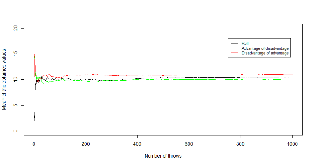
Then, we just need to simulate a fair amount (say, n = 10 000 or 100 000) of every dice rolling method. The first question to answer is: how to get the best rolls on average? The following graph answers it nicely, showing that the “disadvantage of advantage” method leads to better results than just rolling a dice, and even better ones than “advantage of disadvantage”.
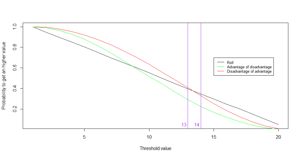
Will this method be efficient for the other problem, which is maximising our chances to roll a value higher than a set threshold (resulting in harming the dragon, for instance, instead of failing miserably in our attempt)? The answer is yes… but only for lower values of the threshold!
As shown by the graph, as long as the threshold is 14 or higher (and killing a dragon might be that hard!), it’s better to just roll a dice. Why? That’s because our advantage and disadvantage modifiers tend to concentrate the distributions of values obtained: getting a 20 on “disadvantage of advantage” means that you need to get a 20 on both previous rollings with advantage, meaning that you need at least one 20 during each one ; this is extremly unlikely!
tl;dr – A 1% death risk is deceptively high – Micromorts (1/10000 th of a percent) are a useful scale to model death risks – Statistical models for human life use ligh-tailed distributions. High values are extremely rare
Today a short post that I had in my drafts for a long time. I didn’t expect that it would (unfortunately) be so relevant to today’s context.
Life is finite and all human activities are risky. Although we all face a certain (hopefully low) risk of dying each time we breathe, it’s not enough reason to prevent us from doing any activities and live isolated in bubbles. But exactly how much risk of dying is acceptable? How much risk on your own life would you be willing to accept?
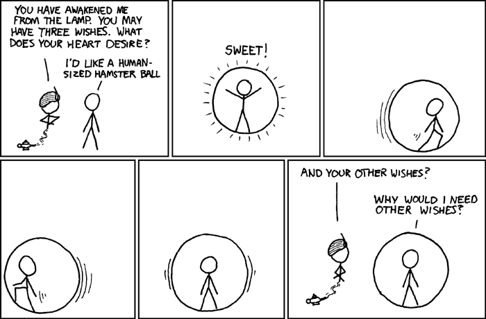
Living in a bubble would be fun! – xkcd.com
Turns out most people, sometimes even trained scientists, are bad at estimating death risk probabilities. They often underestimate how bad even seemingly low probabilities of dying can turn out to be. During a dramatic time of my life where I cared for a child who became suddenly sick. The head surgeon told us she had an 85% chance of making it. So maybe you’re thinking oh it wasn’t that bad! And I mean I understand, 85 is pretty close to 100, situation’s looking fairly good, right?
I was terrified.
To put this number into perspective, imagine if all patients admitted faced such a risk. Let’s say doctors see 15 patients per hour, work 10 hours a day and that the department has 10 doctors. This represents approximately 35’000 patients per year, which seems to fit this UK data. With a 15% death rate, this department would have to deal with more than 5000 deaths over the course of the year, which is the number of people who died in the entire city of San Francisco in 2018! This is one death every 1 hour 40 minutes!
An activity with a 99% chance of survival would certainly kill you in less than a year
In fact, routine surgical procedures with risks greater than 5% are classified high risk. Even a 99% chance of survival doesn’t look so good. If you were enough of a daredevil to engage every day in an activity that exposes you to “only” 1% death probability, then you’d be almost certainly dead within a year. (You can see this easily by using this easy rule of thumb: consider a random event occurring with probability p. Then there is a 95% chance that the event will occur in less than 3/p tries. In this case, this would be 3 / 0.01 = 300 days, which is less than a year)
Micromort – the right scale for death risks
As it turns out, percents are not the right risk scale to talk about death risks. Ronald A. Howard realized this in 1979 and created the notion of micromort. A micromort represents a one-in-a-million chance of dying. Wikipedia has a list of how much risk some activities expose you to:
A micromort is one in a million chance of dying – it is equivalent to tossing 20 coins and getting 20 heads
Wikipedia has a list of how much risk some activities expose you to:
One day alive at age 20 – 1 micromort Skydiving (one jump) – 10 micromorts One day alive at age 90 – 400 micromorts Being infected by the Spanish flu – 30000 micromorts An ascent to Mt Everest – 40000 micromorts
Using this scale, my child’s illness exposed her to 150000 micromorts… which suddenly looks much frightening, and a much more intuitive representation of the risk she was actually exposed to. (Side note if you’re wondering: my kid is fine, and I am really grateful for this 🙏 Diane, if you ever read this you are the sunshine of my life! ❤️☀️)
If this starts feeling scary, don’t worry too much. A risk of one micromort is equivalent to tossing 20 coins and getting only heads. It’s pretty unlikely! The problem is that you’re playing this game every day, and that every once in a while you have to remove some coins. By the time you’re 50, you only have 17 coins left, by the time you’re 90, you only have 11 left.
Statistical models of death
A neat thing about Micromorts is that they also make a good and intuitive statistical model for age at death for humans. Let’s consider this very simple model based on the “game” described in the previous paragraph. Every day you play this game, with a certain risk of dying (for sake of simplicity, let’s forget about modelling childhood and only concentrate on adult life):
Between the ages of 20 and 80, the risk is Floor(age / 10) – 1 micromorts (for example all days of your 26th year, you face a 1 micromort risk, all days in you 63rd year, you face 5 micromorts)
At age 80, the risk jumps to 100 micromorts, and then each year you have to add 50 additional micromorts (which means 150 micromorts at age 81, 200 micromorts at age 82, etc.)
Fun #Statistics fact: death age distribution (of adults) can be modeled simply with:
We can run a few simulations in R to see what life expectancy looks like with this simple model. First let’s define a vector of the risks that match the model we just described:
Then we can run a few simulations to get a vector of age at death for 10 000 people playing this “game”. Note that all simulated values use the vectorization capabilities of the function rbinom:
Not too far from what we observe in most Western countries! For example, life expectancy for Canadian women in 2018 was 84.3 years, and that same year, the oldest Canadian man alive was 109 years old.
In addition to being close to the actual demographic values, the most interesting property of this model is that it was able to generate a light tailed distribution.
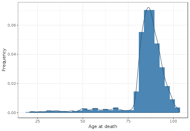
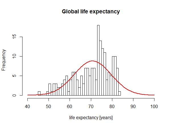
A light tail distribution is one that quickly falls down for the highest values. Contrary to statistical distributions like revenue where extreme values (i.e. values that are several standard deviations greater than the mean) are routinely observed, extreme values are very unlikely when it comes to human life. The oldest person we know of reached 122 years of age and people who make it past 100 years old are still a tiny minority. It is extremely unlikely that we would observe someone living to be 200 or even 150 years old. Even a good old normal distribution would yield extreme values more often (a distribution is said to have “light” and “fat” tails if extreme values are less (resp. more) likely to happen than with a normal distribution). We can see this on this plot from a StackExchange post where life expectancy distribution is plotted against the best normal fit:
Histogram of life expectancy vs. a normal distribution. We can see that extreme values of human life are far less more likely to happen than predicted by the normal distribution
One of the best statistical distributions one can use to model human life is the Weibull distribution. It is a variant of the exponential distribution, that is often studied in high school and is typically used to model memory-less failures (i.e. a probability of failing that is independent of time). The Weibull distribution is very similar except the failure rate increases with time, mimicking an aging process. The statistical model I used for this article is in fact very close to how the Weibull distribution works.
Do you like data science and would be interested in building products that help entrepreneurs around the world start and grow their businesses? Shopify is hiring 🎉 for many locations in Canada 🇨🇦 and around the world 🌎! Feel free to reach out directly to me 🙂
Edit: A previous version of the article didn’t feature the tweet illustrating the simple death model, and had typos in two micromorts numbers that were corrected