Sur le même modèle que l’année dernière (et, nous l’espérons, avec autant de succès !), nous allons tenter de faire nos prédictions pour l’Eurovision 2019, avec toujours un modèle basé sur les statistiques des vidéos publiées sur Youtube (la liste des vidéos en lice cette année est ici).
Les données
Rappel : nous utilisons les informations disponibles sur les vidéos Youtube : nombre de vues, nombre de “Like” et nombre de “Dislike”. Nous récupérons ces informations grâce au package R tuber, qui permet d’aller faire des requêtes par l’API de Youtube et ainsi de récupérer pour chacune des vidéos d’une playlist les informations nécessaires pour le modèle. Ces informations sont ensuite complétées (pour les années 2016, 2017 et 2018) avec le nombre de points obtenus et le rang du classement final.
Par rapport à l’année dernière, on dispose donc d’une année supplémentaire pour l’apprentissage du modèle (pour rappel, les modalités de calcul des points ont changé en 2016, donc on ne peut pas facilement utiliser des éditions antérieures).
Le modèle
L’objectif principal est d’estimer le score que chaque pays va avoir, afin de pouvoir construire le classement final. La méthode utilisée est toujours la régression linéaire sur les variables disponibles (nombre de vues, nombre de “Likes”, nombre de “Dislikes”)
Pour le modèle utilisant uniquement les données 2016 et 2017, calculé l’année dernière, on rappelle que le nombre de vues ne joue pas significativement, le nombre de Likes de façon très mineure et le nombre de Dislikes très nettement, avec un lien positif : plus il y a de pouces baissés, plus le score est important. Ce résultat atypique peut s’expliquer par le fait que la vidéo ukrainienne en 2016, gagnante, a plus de 40 000 pouces baissés.
(Mise à jour : une première version de ce post contenait des erreurs sur le second modèle) Le modèle intégrant les données 2018 (prises quelques semaines avant la finale) en plus change légèrement. Il accorde moins de valeur au nombre de Dislikes (cela peut s’expliquer par le fait que la chanson russe en 2018 avait un nombre de pouces baissés très important, mais n’a pas accédé à la finale, donc n’a pas obtenu un résultat très bon), mais associe désormais positivement le nombre de vues et le score (ce qui n’était pas le cas avant, étonnement).
Ce modèle, construit à partir de plus de données, est celui privilégié ; on comparera tout de même les résultats obtenus par les deux modèles à la fin de cet article !
Les résultats
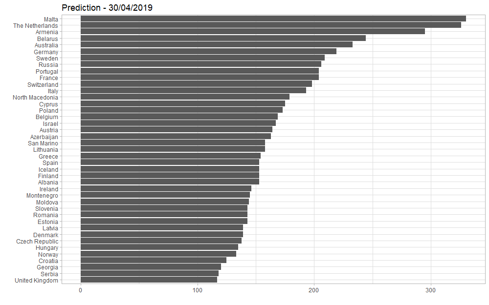
Voici les prédictions obtenues, en utilisant le modèle comprenant les données de 2016 à 2018 et appliqué aux données Youtube 2019 :
Le grand gagnant serait Malte. Ils ne sont pas dans les favoris des bookmakers : voir ici, par exemple, ou plus largement avec les données des paris ici : à la date d’extraction des données, le 30 avril, Malte était classée 8ème.
Voici la vidéo proposée par Malte pour l’Eurovision 2019 (dont l’artiste Michela Pace illustre cette publication) :
Les Pays-Bas sont seconds dans notre modèle. Ce sont eux les grands favoris pour l’instant, avec “Arcade” :
Et pour la France ? 10ème selon notre modèle, 11ème selon les bookmakers, nous ne serons pas a priori les Rois de la compétition :
Mais, quand on sait que la vidéo de Bilal sur sa chaîne Youtube personnelle enregistre presque 6 millions de vues, peut-on penser qu’il y a un biais à ce niveau-là ? À suivre…
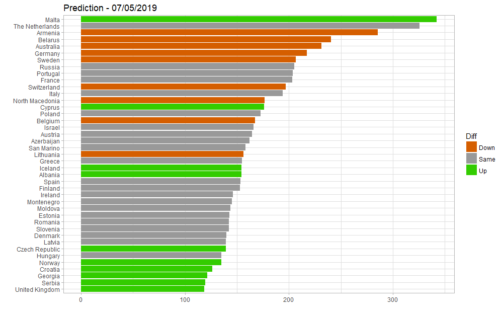
Mise à jour au 7 mai : le modèle avec les nouvelles données Youtube donne des résultats identiques :
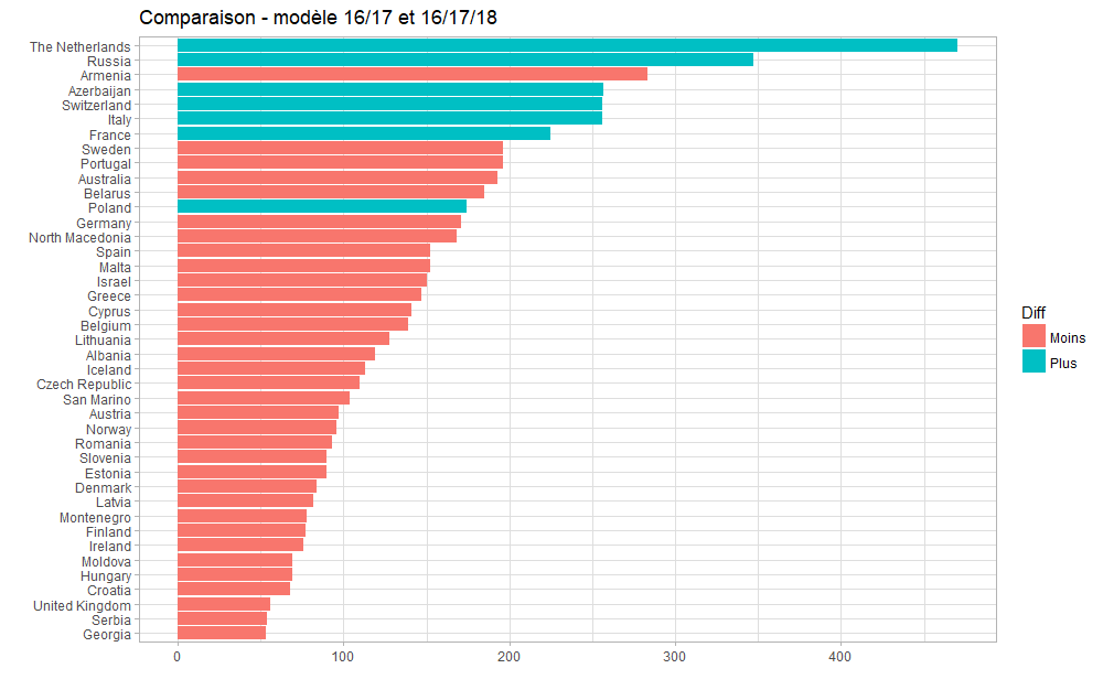
Et avec l’autre modèle ?
En utilisant le modèle comprenant les données de 2016 et 2017 uniquement (et donc, sans 2018), on obtient les résultats suivants, avec, en bleu, les pays pour lesquels le score prédit aurait été plus fort, et en rouge ceux pour qui il aurait été plus faible :
Ce modèle conduit à favoriser les Pays-Bas, et renvoie Malte bien plus bas dans le classement ; mais il se base fortement sur les Dislikes, ce qui n’avait pas été pertinent en 2018… À suivre également !
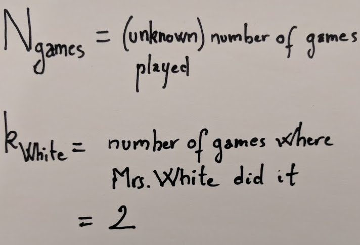
tl;dr -I don’t remember how many games of Clue I’ve played but I do remember being surprised by Mrs White being the murderer in only 2 of those games. Can you give an estimate and an upper bound for the number of games I have played? We solve this problem by using Bayes theorem and discussing the data generation mechanism, and illustrate the solution with R.
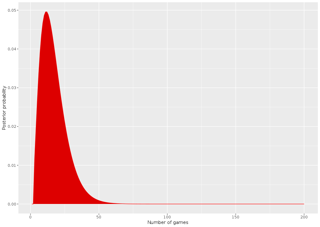
The characters in the original game of Clue. Mrs White is third from the left on the first row (and is now retired!)
Making use of external information with Bayes theorem
Having been raised a frequentist, I first tried to solve this using a max likelihood method, but quickly gave up when I realized how intractable it actually was, especially for the upper bound.
This is a problem where conditioning on external knowledge is key, so the most natural way to tackle it is to use Bayes theorem. This will directly yield an interpretable probability for what we’re looking for (most probable number of and uncertainty interval)
Denote an integer n>3 and:
Our notations for the problem
What we want writes as a simple product of quantities that we can compute, thanks to Bayes:
Bayes theorem gives us directly the probability we are looking for
Notice that there is an “proportional to” sign instead of an equal. This is because the denominator is just a normalization constant, which we can take care of easily after computing the likelihood and the prior.
Likelihood
The likelihood indicates the odds of us observing the data (in this case, that k_Mrs_White = 2) given the value of the unknown parameter (here the number of games played). Since at the beginning of each game the murderer is chosen at uniform random between 6 characters, the number of times Mrs White ends up being the culprit can be modeled as a binomial distribution with parameters n and 1/6.
This will be easily obtained using the dbinom function, which gives directly the exact value of P(x = k), for any x and a binomial distribution of parameters n and p. Let’s first import a few useful functions that I put in our GitHub repo to save some space on this post, and set a few useful parameters:
library(tidyverse)
source("clue/clue_functions.R")

## Parameters
k_mrs_white <- 2 # Number of times Mrs. White was the murderer
prob <- 1/6 # Probability of Mrs. White being the murderer for one game
Note that we can’t exactly obtain the distribution for any game from 1 to infinity, so we actually compute the distribution for 1 to 200 games (this doesn’t matter much in practice):
x <- 1:200 # Reduction of the problem to a finite number of games

## Likelihood
dlikelihood <- dbinom(k_mrs_white, x, prob)
easy enough 🙂
Side note: when I was a student, I kept forgetting that the distribution functions existed in R and whenever I needed them I used to re-generate them using the random generation function (rbinom in this case) 🤦♂️
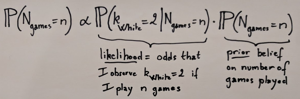
Prior
There are a lot of possible choices for the prior but here I’m going to consider that I don’t have any real reason to believe and assume a uniform probability for any number of games between 3 and 200:
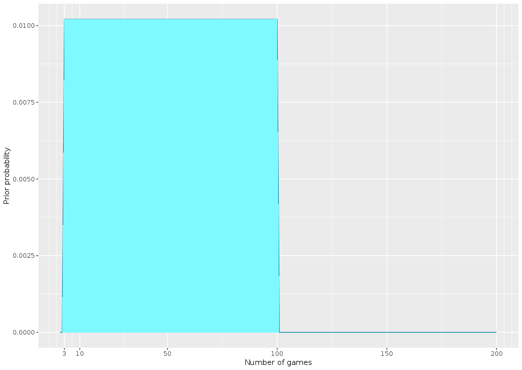
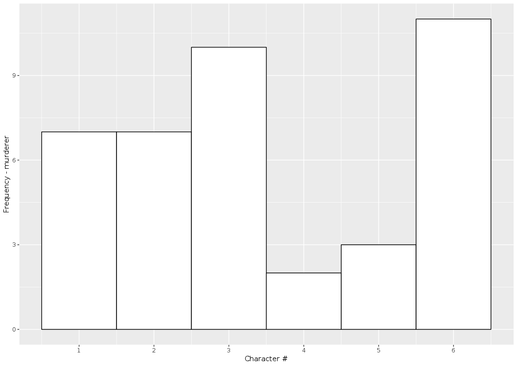
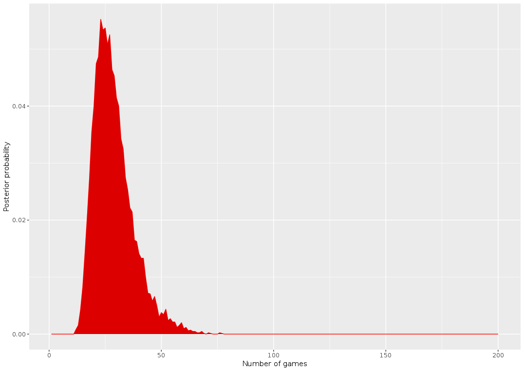
I find this result very unsatisfying. It doesn’t “feel” right to me that someone would be surprised by only 2 occurrences of Mrs White being guilty in such a small number of games! For example, I simulated 40 games, a number that was supposedly suspiciously high according to the model:
Simulating 40 games of Clue. Character #4 and #5 were the murderer in respectively only 2 and 3 games
We observe that characters #4 and #5 are the murderers in respectively only 2 and 3 games!
In the end I think what really counts is not the likelihood that *Mrs White* was the murderer 2 times, but that the *minimum* number of times one of the characters was the culprit was 2 times!
I think it’s a cool example of a problem where just looking at the data available is not enough to make good inference – you also have to think about *how* the data was generated (in a way, it’s sort of a twist of the Monty Hall paradox, which is one of the most famous examples of problems where the data generation mechanism is critical to understand the result).
I wrote a quick and dirty function based on simulations to generate this likelihood, given a certain number of games. I saved the distribution directly in the GitHub (and called it Gumbel since it kinda looks like an extreme value problem) so that we can call it and do the same thing as above:
The new posterior has the same shape but appears shifted to the right. For example N_games = 50 seems much more likely now! The estimates are now 23 for the number of games:
> which.max(dposterior_gen)
[1] 23
And 51 for the max bound of the uncertainty interval
J’ai pris la (mauvaise ?) habitude d’utiliser Google Maps et son système de notation (chaque utilisateur peut accorder une note de une à cinq étoiles) pour décider d’où je me rend : restaurants, lieux touristiques, etc. Récemment, j’ai déménagé et je me suis intéressé aux piscines environnantes, pour me rendre compte que leur note tournait autour de 3 étoiles. Je me suis alors fait la réflexion que je ne savais pas, si, pour une piscine, il s’agissait d’une bonne ou d’une mauvaise note ! Pour les restaurants et bars, il existe des filtres permettant de se limiter dans sa recherche aux établissements ayant au moins 4 étoiles ; est-ce que cela veut dire que cette piscine est très loin d’être un lieu de qualité ? Pourtant, dès lors qu’on s’intéresse à d’autres types de services comme les services publics, ou les hôpitaux, on se rend compte qu’il peut y avoir de nombreux avis négatifs, et des notes très basses, par exemple :
Pour répondre à cette question, il faudrait connaître les notes qu’ont les autres piscines pour savoir si 3 étoiles est un bon score ou non. Il serait possible de le faire manuellement, mais ce serait laborieux ! Pour éviter cela, nous allons utiliser l’API de GoogleMaps (Places, vu qu’on va s’intéresser à des lieux et non des trajets ou des cartes personnalisées).
API, késako? Une API est un système intégré à un site web permettant d’y accéder avec des requêtes spécifiques. J’avais déjà utilisé une telle API pour accéder aux données sur le nombre de vues, de like, etc. sur Youtube ; il existe aussi des API pour Twitter, pour Wikipedia…
Pour utiliser une telle API, il faut souvent s’identifier ; ici, il faut disposer d’une clef API spécifique pour Google Maps qu’on peut demander ici. On peut ensuite utiliser l’API de plusieurs façons : par exemple, faire une recherche de lieux avec une chaîne de caractères, comme ici “Piscine in Paris, France” (avec cette fonction) ; ensuite, une fois que l’on dispose de l’identifiant du lieu, on peut chercher plus de détails, comme sa note, avec cette fonction. De façon pratique, j’ai utilisé le package googleway qui possède deux fonctions qui font ce que je décris juste avant : google_place et google_place_details.
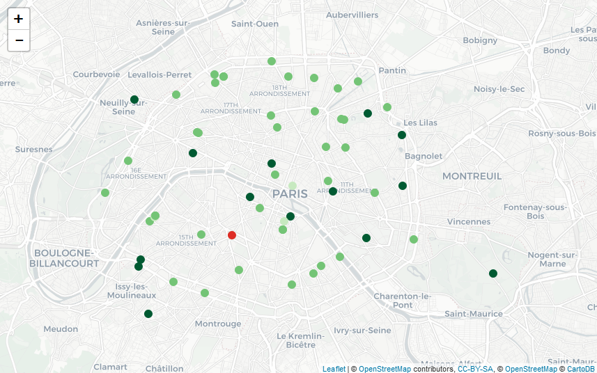
En utilisant ces fonctions, j’ai réussi à récupérer de l’information sur une soixantaine de piscines à Paris et ses environs très proches (je ne sais pas s’il s’agit d’une limite de l’API, mais le nombre ne semblait pas aberrant !). J’ai récupéré les notes et je constate ainsi que la note moyenne est autour de 3.5, ce qui laisse à penser que les piscines à proximité de mon nouvel appartement ne sont pas vraiment les meilleures… De façon plus visuelle, je peux ensuite représenter leur note moyenne (en rouge quand on est en dessous de 2, en vert de plus en plus foncé au fur et à mesure qu’on se rapproche de 5) sur la carte suivante (faite avec Leaflet, en utilisant le très bon package leaflet)
Comparaison avec d’autres lieux
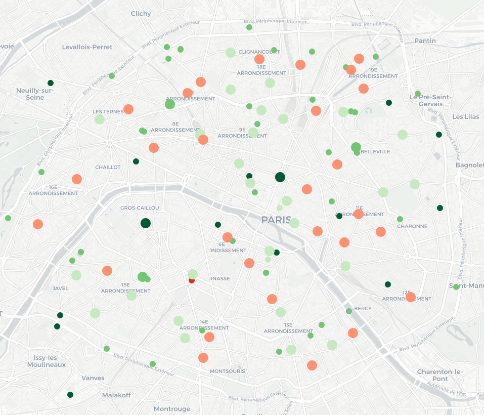
En explorant Google Maps aux alentours, je me suis rendu compte que les agences bancaires du quartier étaient particulièrement mal notées, en particulier pour une banque spécifique (dont je ne citerai pas le nom – mais dont le logo est un petit animal roux). Je peux utiliser la même méthode pour récupérer par l’API des informations sur ces agences (et je constate qu’effectivement, la moyenne des notes est de 2 étoiles), puis les rajouter sur la même carte (les piscines correspondent toujours aux petits cercles ; les agences bancaires sont représentées par des cercles plus grands), en utilisant le même jeu de couleurs que précédemment :
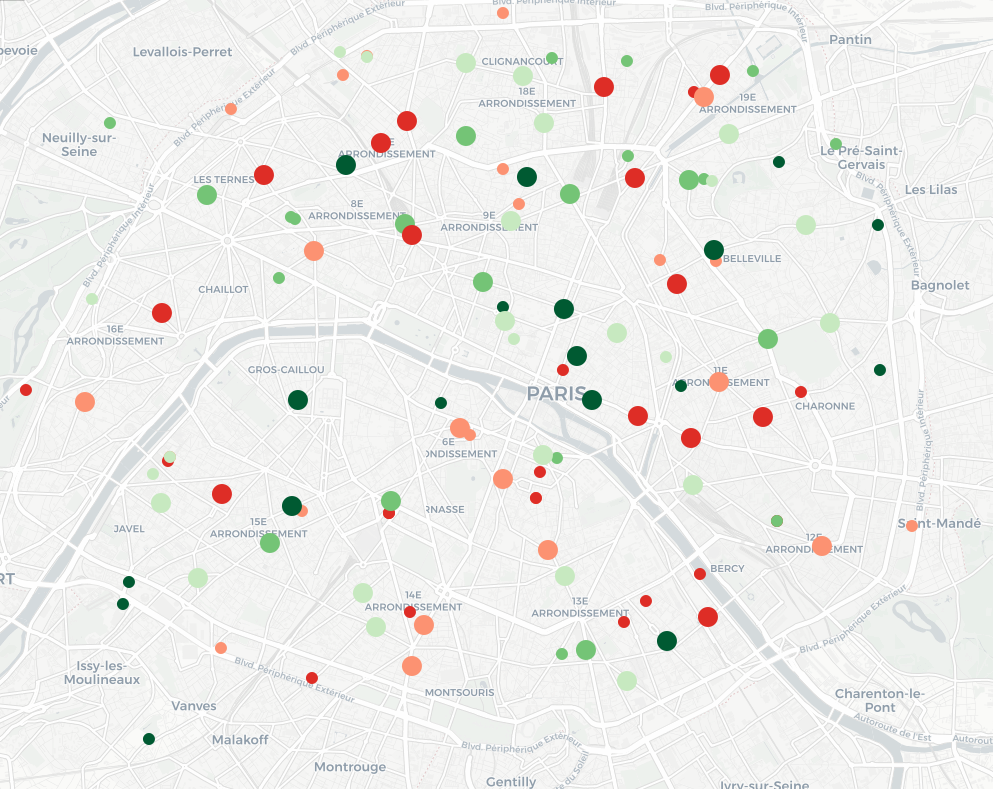
La carte est difficile à lire : on remarque surtout que les petits cercles (les piscines) sont verts et que les grands (les agences bancaires) sont rouges. Or, il pourrait être intéressant de pouvoir comparer entre eux les lieux de même type. Pour cela, nous allons séparer au sein des piscines les 20% les moins bien notées, puis les 20% d’après, etc., et faire de même avec les agences bancaires. On applique ensuite un schéma de couleur qui associe du rouge aux 40% des lieux les pires – relativement (40% des piscines et 40% des agences bancaires), et du vert pour les autres. La carte obtenue est la suivante : elle permet de repérer les endroits de Paris où se trouvent, relativement, les meilleurs piscines et les meilleures agences bancaires en un seul coup d’œil !
Google introduit des modifications aux notes (en particulier quand il y a peu de notes, voir ici (en), mais pas seulement (en)) ; il pourrait être intéressant d’ajouter une fonctionnalité permettant de comparer les notes des différents lieux relativement aux autres de même catégorie !
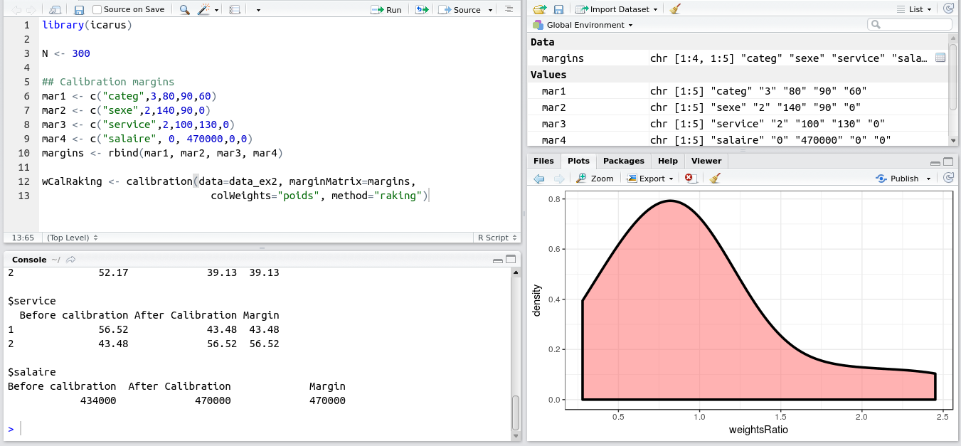
This weekend I released version 0.3.0 of the Icarus package to CRAN.
Icarus provides tools to help perform calibration on margins, which is a very important method in sampling. One of these days I’ll write a blog post explaining calibration on margins! In the meantime if you want to learn more, you can read our course on calibration (in French) or the original paper of Deville and Sarndal (1992). Shortly said, calibration computes new sampling weights so that the sampling estimates match totals we already know thanks to another source (census, typically).
In the industry, one of the most widely used software for performing calibration on margins is the SAS macro Calmar developed at INSEE. Icarus is designed with the typical Calmar user in mind if s/he whishes to find a direct equivalent in R. The format expected by Icarus for the margins and the variables is directly inspired by Calmar’s (wiki and example here). Icarus also provides the same kind of graphs and stats aimed at helping statisticians understand the quality of their data and estimates (especially on domains), and in general be able to understand and explain the reweighting process.
Example of Icarus in RStudio
I hope I find soon the time to finish a full well documented article to submit to a journal and set it as a vignette on CRAN. For now, here are the slides (in French, again) I presented at the “colloque francophone sondages” in Gatineau last october: https://nc233.com/icarus.
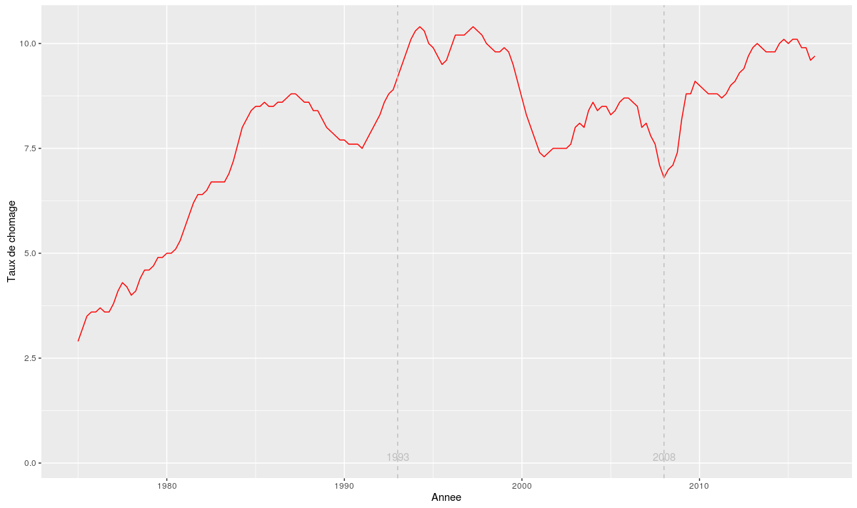
Aujourd’hui un petit post un peu plus “pratique”. On va réaliser le graphique du taux de chômage en France depuis 1975 en utilisant R. Les données sont disponibles sur le site de l’INSEE. En suivant ce lien on va pouvoir les télécharger au format csv. Mais il est beaucoup plus sympathique d’utiliser une méthode un peu plus automatique pour récupérer ces données. Ainsi, dès que l’INSEE les mettra à jour (le trimestre prochain par exemple), il suffira de relancer le script R et le graphe se mettra automatiquement à jour.
Pour ce faire, on va utiliser la compatibilité du nouveau site de l’Insee avec la norme SDMX. Le package R rsdmx va nous permettre de récupérer facilement les données en utilisant cette fonctionnalité :
install.packages("rsdmx")
library(rsdmx)
Sur la page correspondant aux données sur le site de l’Insee, on récupère l’identifiant associé : 001688526. Cela permet de construire l’adresse à laquelle on va pouvoir demander à rsdmx de récupérer les données : http://www.bdm.insee.fr/series/sdmx/data/SERIES_BDM/001688526. On peut également ajouter des paramètres supplémentaires en les ajoutant à la suite de l’url (en les séparant par un “?”). On utilise ensuite cette adresse avec la fonction readSDMX:
Les deux colonnes qui vont nous intéresser sont “TIME_PERIOD” (date de la mesure) et “OBS_VALUE” (taux de chômage estimé). Pour le moment, ces données sont au format “caractère”. On va les transformer respectivement en “date” et en “numérique”. Notez que l’intégration du trimestre nécessite de passer par le package “zoo” (pour la fonction as.yearqtr) :
library(zoo)

donnees_chomage$OBS_VALUE <- as.numeric(donnees_chomage$OBS_VALUE)

donnees_chomage$TIME_PERIOD <- as.yearqtr(donnees_chomage$TIME_PERIOD, format = "%Y-Q%q")
Il ne reste plus qu’à utiliser l’excellent package ggplot2 pour créer le graphe. On en profite pour ajouter des lignes verticales en 1993 et 2008 (dates des deux dernières crises économiques majeures) :
This year we’ve had a great summer for sporting events! Now autumn is back, and with it the Ligue 1 championship. Last year, we created this data analysis tutorial using R and the excellent package FactoMineR for a course at ENSAE (in French). The dataset contains the physical and technical abilities of French Ligue 1 and Ligue 2 players. The goal of the tutorial is to determine with our data analysis which position is best for Mathieu Valbuena 🙂
The dataset
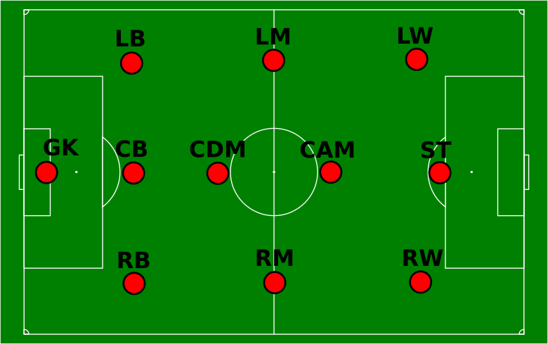
A small precision that could prove useful: it is not required to have any advanced knowledge of football to understand this tutorial. Only a few notions about the positions of the players on the field are needed, and they are summed up in the following diagram:
Positions of the fooball players on the field
The data come from the video game Fifa 15 (which is already 2 years old, so there may be some differences with the current Ligue 1 and Ligue 2 players!). The game features rates each players’ abilities in various aspects of the game. Originally, the grade are quantitative variables (between 0 and 100) but we transformed them into categorical variables (we will discuss why we chose to do so later on). All abilities are thus coded on 4 positions : 1. Low / 2. Average / 3. High / 4. Very High.
Loading and prepping the data
Let’s start by loading the dataset into a data.frame. The important thing to note is that FactoMineR requires factors. So for once, we’re going to let the (in)famous stringsAsFactors parameter be TRUE!
The second line transforms the integer columns into factors also. FactoMineR uses the row.names of the dataframes on the graphs, so we’re going to set the players names as row names:
Here’s what our object looks like (we only display the first few lines here):
> head(frenchLeague)
                     foot position league age height overall
Florian Thauvin      left       RM Ligue1   1      3       4
Layvin Kurzawa       left       LB Ligue1   1      3       4
Anthony Martial     right       ST Ligue1   1      3       4
Clinton N'Jie       right       ST Ligue1   1      2       3
Marco Verratti      right       MC Ligue1   1      1       4
Alexandre Lacazette right       ST Ligue1   2      2       4
Data analysis
Our dataset contains categorical variables. The appropriate data analysis method is the Multiple Correspondance Analysis. This method is implemented in FactoMineR in the method MCA. We choose to treat the variables “position”, “league” and “age” as supplementary:
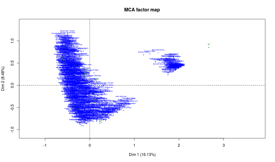
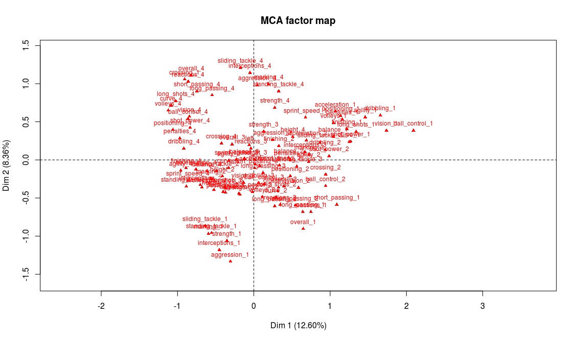
This produces three graphs: the projection on the factorial axes of categories and players, and the graph of the variables. Let’s just have a look at the second one of these graphs:
Projection of the players on the first two factorial axes (click to enlarge)
Before trying to go any further into the analysis, something should alert us. There clearly are two clusters of players here! Yet the data analysis techniques like MCA suppose that the scatter plot is homogeneous. We’ll have to restrict the analysis to one of the two clusters in order to continue.
On the previous graph, supplementary variables are shown in green. The only supplementary variable that appears to correspond to the cluster on the right is the goalkeeper position (“GK”). If we take a closer look to the players on this second cluster, we can easily confirm that they’re actually all goalkeeper. This absolutely makes a lot of sense: in football, the goalkeeper is a very different position, and we should expect these players to be really different from the others. From now on, we will only focus on the positions other than goalkeepers. We also remove from the analysis the abilities that are specific to goalkeepers, which are not important for other players and can only add noise to our analysis:
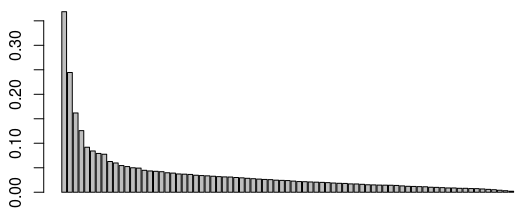
Obviously, we have to start by reducing the analysis to a certain number of factorial axes. My favorite method to chose the number of axes is the elbow method. We plot the graph of the eigenvalues:
> barplot(mca_no_gk$eig$eigenvalue)
Graph of the eigenvalues
Around the third or fourth eigenvalue, we observe a drop of the values (which is the percentage of the variance explained par the MCA). This means that the marginal gain of retaining one more axis for our analysis is lower after the 3rd or 4th first ones. We thus choose to reduce our analysis to the first three factorial axes (we could also justify chosing 4 axes). Now let’s move on to the interpretation, starting with the first two axes:
Projection of the abilities on the first two factorial axes
We could start the analysis by reading on the graph the name of the variables and modalities that seem most representative of the first two axes. But first we have to keep in mind that there may be some of the modalities whose coordinates are high that have a low contribution, making them less relevant for the interpretation. And second, there are a lot of variables on this graph, and reading directly from it is not that easy. For these reasons, we chose to use one of FactoMineR’s specific functions, dimdesc (we only show part of the output here):
The most representative abilities of the first axis are, on the right side of the axis, a weak level in attacking abilities (finishing, volleys, long shots, etc.) and on the left side a very strong level in those abilities. Our interpretation is thus that axis 1 separates players according to their offensive abilities (better attacking abilities on the left side, weaker on the right side). We procede with the same analysis for axis 2 and conclude that it discriminates players according to their defensive abilities: better defenders will be found on top of the graph whereas weak defenders will be found on the bottom part of the graph.
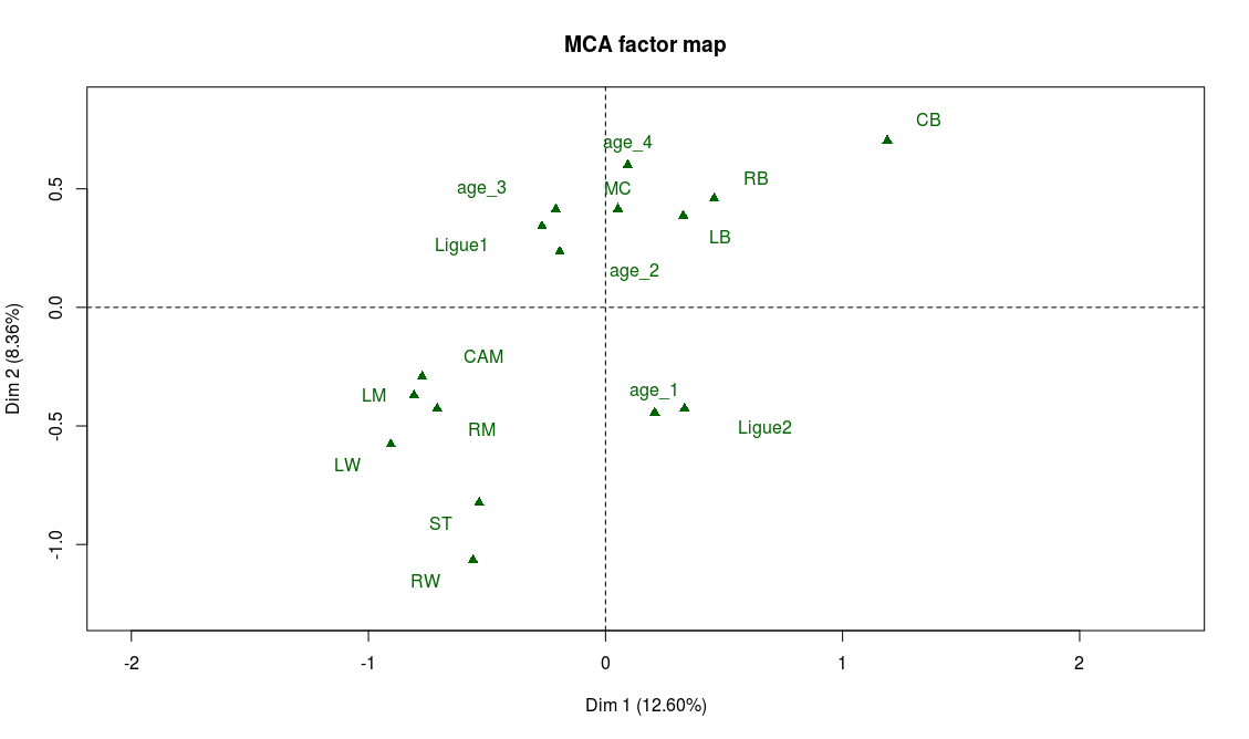
Supplementary variables can also help confirm our interpretation, particularly the position variable:
> plot.MCA(mca_no_gk, invisible = c("ind","var"))
Projection of the supplementary variables on the first two factorial axis
And indeed we find on the left part of the graph the attacking positions (LW, ST, RW) and on the top part of the graph the defensive positions (CB, LB, RB).
If our interpretation is correct, the projection on the second bissector of the graph will be a good proxy for the overall level of the player. The best players will be found on the top left area while the weaker ones will be found on the bottom right of the graph. There are many ways to check this, for example looking at the projection of the modalities of the variable “overall”. As expected, “overall_4” is found on the top-left corner and “overall_1” on the bottom-right corner. Also, on the graph of the supplementary variables, we observe that “Ligue 1” (first division of the french league) is on the top-left area while “Ligue 2” (second division) lies on the bottom-right area.
With only these two axes interpreted there are plenty of fun things to note:
Left wingers seem to have a better overall level than right wingers (if someone has an explanation for this I’d be glad to hear it!)
Age is irrelevant to explain the level of a player, except for the younger ones who are in general weaker.
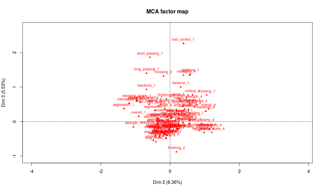
Projection of the variables on the 2nd and 3rd factorial axes
Modalities that are most representative of the third axis are technical weaknesses: the players with the lower technical abilities (dribbling, ball control, etc.) are on the end of the axis while the players with the highest grades in these abilities tend to be found at the center of the axis:
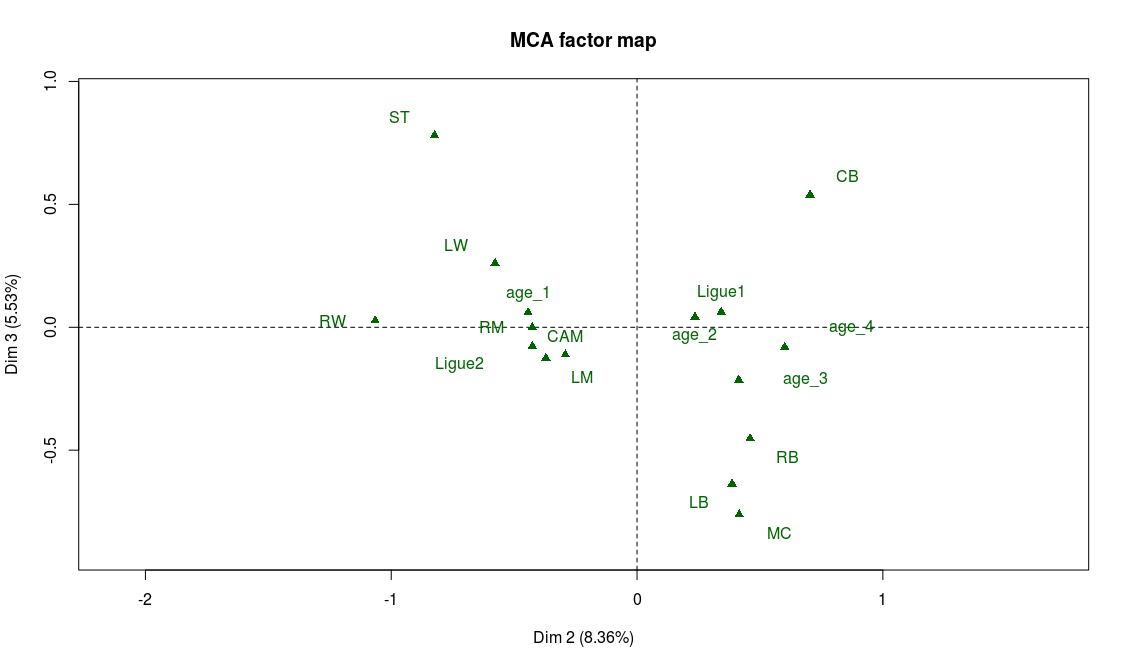
Projection of the supplementary variables on the 2nd and 3rd factorial axes
We note with the help of the supplementary variables, that midfielders have the highest technical abilities on average, while strikers (ST) and defenders (CB, LB, RB) seem in general not to be known for their ball control skills.
Now we see why we chose to make the variables categorical instead of quantitative. If we had kept the orginal variables (quantitative) and performed a PCA on the data, the projections would have kept the orders for each variable, unlike what happens here for axis 3. And after all, isn’t it better like this? Ordering players according to their technical skills isn’t necessarily what you look for when analyzing the profiles of the players. Football is a very rich sport, and some positions don’t require Messi’s dribbling skills to be an amazing player!
Mathieu Valbuena
Now we add the data for a new comer in the French League, Mathieu Valbuena (actually Mathieu Valbuena arrived in the French League in August of 2015, but I warned you that the data was a bit old ;)). We’re going to compare Mathieu’s profile (as a supplementary individual) to the other players, using our data analysis.
Last two lines produce the graphs with Mathieu Valbuena on axes 1 and 2, then 2 and 3:
Axes 1 and 2 with Mathieu Valbuena as a supplementary individual (click to enlarge)
Axes 2 and 3 with Mathieu Valbuena as a supplementary individual (click to enlarge)
So, Mathieu Valbuena seems to have good offensive skills (left part of the graph), but he also has a good overall level (his projection on the second bissector is rather high). He also lies at the center of axis 3, which indicates he has good technical skills. We should thus not be surprised to see that the positions that suit him most (statistically speaking of course!) are midfield positions (CAM, LM, RM). With a few more lines of code, we can also find the French league players that have the most similar profiles:
And we get: Ladislas Douniama, Frédéric Sammaritano, Florian Thauvin, N’Golo Kanté and Wissam Ben Yedder.
There would be so many other things to say about this data set but I think it’s time to wrap this (already very long) article up 😉 Keep in mind that this analysis should not be taken too seriously! It just aimed at giving a fun tutorial for students to discover R, FactoMineR and data analysis.


![[19] Données du chômage avec R et SDMX-ML](https://nc233.com/wp-content/uploads/2016/12/taux_chomage_ggplot-825x510.png)