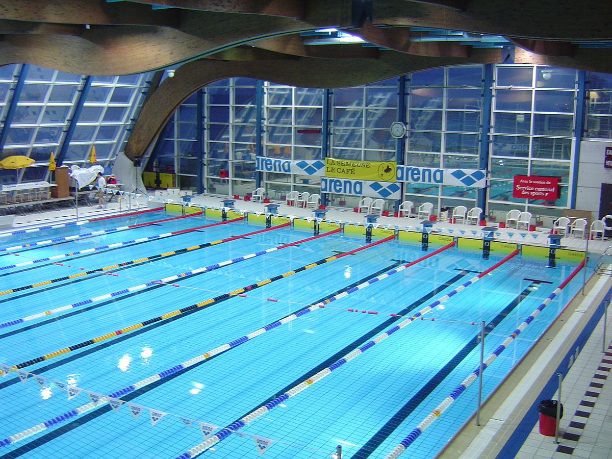
Est-ce que cette piscine est bien notée ?

J’ai pris la (mauvaise ?) habitude d’utiliser Google Maps et son système de notation (chaque utilisateur peut accorder une note de une à cinq étoiles) pour décider d’où je me rend : restaurants, lieux touristiques, etc. Récemment, j’ai déménagé et je me suis intéressé aux piscines environnantes, pour me rendre compte que leur note tournait autour de 3 étoiles. Je me suis alors fait la réflexion que je ne savais pas, si, pour une piscine, il s’agissait d’une bonne ou d’une mauvaise note ! Pour les restaurants et bars, il existe des filtres permettant de se limiter dans sa recherche aux établissements ayant au moins 4 étoiles ; est-ce que cela veut dire que cette piscine est très loin d’être un lieu de qualité ? Pourtant, dès lors qu’on s’intéresse à d’autres types de services comme les services publics, ou les hôpitaux, on se rend compte qu’il peut y avoir de nombreux avis négatifs, et des notes très basses, par exemple :

Pour répondre à cette question, il faudrait connaître les notes qu’ont les autres piscines pour savoir si 3 étoiles est un bon score ou non. Il serait possible de le faire manuellement, mais ce serait laborieux ! Pour éviter cela, nous allons utiliser l’API de GoogleMaps (Places, vu qu’on va s’intéresser à des lieux et non des trajets ou des cartes personnalisées).

API, késako? Une API est un système intégré à un site web permettant d’y accéder avec des requêtes spécifiques. J’avais déjà utilisé une telle API pour accéder aux données sur le nombre de vues, de like, etc. sur Youtube ; il existe aussi des API pour Twitter, pour Wikipedia

Pour utiliser une telle API, il faut souvent s’identifier ; ici, il faut disposer d’une clef API spécifique pour Google Maps qu’on peut demander ici. On peut ensuite utiliser l’API de plusieurs façons : par exemple, faire une recherche de lieux avec une chaîne de caractères, comme ici “Piscine in Paris, France” (avec cette fonction) ; ensuite, une fois que l’on dispose de l’identifiant du lieu, on peut chercher plus de détails, comme sa note, avec cette fonction. De façon pratique, j’ai utilisé le package googleway qui possède deux fonctions qui font ce que je décris juste avant : google_place et google_place_details.

En utilisant ces fonctions, j’ai réussi à récupérer de l’information sur une soixantaine de piscines à Paris et ses environs très proches (je ne sais pas s’il s’agit d’une limite de l’API, mais le nombre ne semblait pas aberrant !). J’ai récupéré les notes et je constate ainsi que la note moyenne est autour de 3.5, ce qui laisse à penser que les piscines à proximité de mon nouvel appartement ne sont pas vraiment les meilleures… De façon plus visuelle, je peux ensuite représenter leur note moyenne (en rouge quand on est en dessous de 2, en vert de plus en plus foncé au fur et à mesure qu’on se rapproche de 5) sur la carte suivante (faite avec Leaflet, en utilisant le très bon package leaflet)

Comparaison avec d’autres lieux

En explorant Google Maps aux alentours, je me suis rendu compte que les agences bancaires du quartier étaient particulièrement mal notées, en particulier pour une banque spécifique (dont je ne citerai pas le nom – mais dont le logo est un petit animal roux). Je peux utiliser la même méthode pour récupérer par l’API des informations sur ces agences (et je constate qu’effectivement, la moyenne des notes est de 2 étoiles), puis les rajouter sur la même carte (les piscines correspondent toujours aux petits cercles ; les agences bancaires sont représentées par des cercles plus grands), en utilisant le même jeu de couleurs que précédemment :

La carte est difficile à lire : on remarque surtout que les petits cercles (les piscines) sont verts et que les grands (les agences bancaires) sont rouges. Or, il pourrait être intéressant de pouvoir comparer entre eux les lieux de même type. Pour cela, nous allons séparer au sein des piscines les 20% les moins bien notées, puis les 20% d’après, etc., et faire de même avec les agences bancaires. On applique ensuite un schéma de couleur qui associe du rouge aux 40% des lieux les pires – relativement (40% des piscines et 40% des agences bancaires), et du vert pour les autres. La carte obtenue est la suivante : elle permet de repérer les endroits de Paris où se trouvent, relativement, les meilleurs piscines et les meilleures agences bancaires en un seul coup d’œil !

Google introduit des modifications aux notes (en particulier quand il y a peu de notes, voir ici (en), mais pas seulement (en)) ; il pourrait être intéressant d’ajouter une fonctionnalité permettant de comparer les notes des différents lieux relativement aux autres de même catégorie !

Analyse de pronostics pour le Mondial 2018

On est les champions ! Si nous n’avons pas eu le temps de faire un modèle de prédiction pour cette coupe du monde de football 2018 (mais FiveThirtyEight en a fait un très sympa, voir ici), cela ne nous a pas empêché de faire un concours de pronostics entre collègues et ex-collègues statisticiens, sur le site Scorecast. Les résultats obtenus sont les suivants :

JoueurScore
Nic102
Cle100
Ron100
Lud96
Tho90
Lio88
Lis87
Pap86
Mau84
Yan78
Ant78
Lau75
Thi71
Arn56
Oli28
Mar7

Un autre système de points ?

Le système de points utilisé par Scorecast est le suivant : si on a le bon gagnant, on gagne un faible nombre de points ; si en plus du bon gagnant, on a bien prédit l’écart de buts, on gagne un peu plus de points ; et enfin, si on a le score exact, on gagne le nombre maximal de points. Ce nombre maximal de points augmente au fur et à mesure de la compétition : la finale vaut plus de points qu’un match de poules. Ce système ne tient pas compte de cotes préexistantes (comme le fait par exemple Mon petit prono), ou du fait que certains matchs sont bien prédits par tout le monde alors que pour d’autres seule une personne a bien trouvé, voire personne.

Je propose donc ici d’altérer légèrement l’attribution des points, de la façon suivante : on dispose d’un nombre de points équivalent pour chaque match d’une même manche (match de poule, de quart, etc.), qu’on répartit entre les joueurs qui ont bien prédit le score, avec un avantage pour ceux qui ont le bon écart de points ou le bon score exact. Le nombre de points à répartir augmente tout au long de la compétition, de sorte que les phases finales aient plus d’importance dans le classement final.

Pourquoi faire ça ? Pour favoriser les joueurs qui ont fait des paris plus originaux et potentiellement plus risqués, ou en tout cas qui étaient les seuls à avoir la bonne intuition. Voici les résultats :

JoueurScoreScore modifié
Mau84185
Lud96163
Nic102144
Tho90136
Ant78135
Cle100126
Ron100123
Lis87120
Lio88115
Pap86108
Yan78105
Lau75100
Thi7190
Arn5678
Oli2843
Mar710

On constate que le classement évolue sensiblement avec cette nouvelle méthode de points ! Mais peut-être que certains auraient fait d’autres paris si ces règles étaient décidées…

Choix des scores

Une des principales difficultés du pronostic est qu’il ne suffit pas de savoir (ou de penser savoir) qui va gagner le match, mais il faut aussi indiquer le score attendu. Regardons si les prédictions de l’ensemble des parieurs de notre ligue ont été pertinentes par rapport aux vrais scores ! Pour cela, on détermine pour chaque score le pourcentage des matchs qui ont abouti à ce résultat d’une part, et le pourcentage des paris faits avec ce score. On regarde ensuite la différence entre les pourcentages, qu’on va illustrer par la heatmap ci-dessous. Les cases vertes correspondent aux scores des matchs trop rarement prédits ; les cases rouges aux scores très souvent prédits mais qui n’arrivent que peu ou pas.

On constate que l’on a surestimé largement le nombre de 2-1, de 3-0 et de 4-0 (score qui n’est jamais arrivé lors de cette coupe du monde) ; ce sont d’ailleurs les seuls “gros” scores qui ont été surestimés dans les prédictions : tous les autres ont été sous-évalués. Cela peut laisser penser que les paris ont été faits avec une logique conservative et en évitant de tenter des scores absurdes, comme 7-0 pour l’Arabie Saoudite contre la Russie !

Analyse de données et classification

Enfin, une dernière utilisation possible de ce jeu de données est d’en faire l’analyse pour en extraire des classes de parieurs ayant un peu le même profil (ou en tout cas les mêmes réussites), et pour voir ce qui les sépare. Plusieurs méthodes sont possibles pour cela.

Commençons par un grand classique : la Classification Ascendante Hiérarchique (CAH pour les intimes), qui est une méthode qui part de groupes d’une personne, et qui, à chaque étape, regroupe deux groupes de telle façon à ce que l’inertie intra augmente au minimum. De façon moins barbare, cela veut dire qu’on regroupe les deux groupes qui se ressemblent le plus, étape par étape, jusqu’à arriver à la population totale. On représente souvent ce type de méthodes par un dendogramme, qui ressemble un peu à un arbre phylogénétique en biologie de l’évolution, et qui illustre la construction des classes, de bas en haut.

On remarque qu’il y a de nombreux binômes qui sont cohérents, et qui signalent des parieurs avec des profils comparables (par exemple, Mar et Oli, qui correspondent à deux joueurs ayant raté une bonne partie de la compétition, soit en arrêtant les paris, soit en arrivant en cours), et qu’il y a une séparation entre les quatre joueurs de gauche et les autres (eux-mêmes largement séparés entre les 3 les plus à gauche et les autres).

Une autre possibilité est d’utiliser l’Analyse en Composantes Principales, que nous avions déjà utilisé dans un contexte footballistique ici ou ici (en). La logique est ici de chercher à résumer une matrice avec beaucoup d’informations (pour chaque joueur, l’ensemble des points obtenus via ses paris pour chaque match) en un nombre minimal de dimensions, dits d’axes, qui suffisent pour avoir une bonne idée de la logique d’organisation du jeu de données.

Si l’on réalise cette méthode ici, voici ce que l’on obtient sur les premiers axes :

L’axe 1 est souvent victime de ce qu’on appelle l'”effet taille” : on entend par là le fait que les individus ayant de grandes valeurs de certaines variables en ont souvent aussi pour les autres variables, et symétriquement pour les individus qui ont des petites valeurs. En effet, on voit que la variable supplémentaire, le total de points obtenus (avec la méthode Scorecast), en bleu, est proche de l’axe 1. Cela veut dire que les individus à droite de l’axe ont tendance à avoir un score important, tandis que ceux à gauche n’ont pas très bien réussi leurs prédictions.

On constate également que les représentations sur les plans constitués des dimensions 1-2, et 2-3, ont tendance à rapprocher les individus que la classification effectuée plus haut associait en binôme. Cela montre une certaine cohérence, ce qui est toujours rassurant !

Plus dans le détail, on voit que les axes 2 et 3 semblent correspondre aux paris suivants, qui sont donc discriminants entre les différents joueurs :

  • Pour l’axe 2, avoir réussi son pari sur les matchs Pérou-Danemark, Mexique-Suède, Brésil-Suisse, Espagne-Russie et Argentine-Croatie
  • Pour l’axe 3, avoir réussi son pari sur les matchs Japon-Sénégal, Suisse-Costa Rica, Danemark-France ou encore Brésil-Mexique

Difficile de trouver une interprétation de ces axes…

Weighting tricks for machine learning with Icarus – Part 1

Calibration in survey sampling is a wonderful tool, and today I want to show you how we can use it in some Machine Learning applications, using the R package Icarus. And because ’tis the season, what better than a soccer dataset to illustrate this? The data and code are located on this gitlab repo: https://gitlab.com/haroine/weighting-ml

weighting ML gitlab
https://gitlab.com/haroine/weighting-ml

First, let’s start by installing and loading icarus and nnet, the two packages needed in this tutorial, from CRAN (if necessary):

install.packages(c("icarus","nnet"))
library(icarus)
library(nnet)

Then load the data:

load("data/weighting_ML_part1.RData")

The RData file contains two dataframes, one for the training set and one for the test set. They contain results of some international soccer games, from 01/2008 to 12/2016 for the training set, and from 01/2017 to 11/2017 for the test. Along with the team names and goals scored for each side, a few descriptive variables that we’re going to use as features of our ML models:

> head(train_soccer)
        Date                   team opponent_team home_field elo_team
1 2010-10-12                Belarus       Albania          1      554
2 2010-10-08 Bosnia and Herzegovina       Albania          0      544
3 2011-06-07 Bosnia and Herzegovina       Albania          0      594
4 2011-06-20              Argentina       Albania          1     1267
5 2011-08-10             Montenegro       Albania          0      915
6 2011-09-02                 France       Albania          0      918
  opponent_elo importance goals_for goals_against outcome year
1          502          1         2             0     WIN 2010
2          502          1         1             1    DRAW 2010
3          564          1         2             0     WIN 2011
4          564          1         4             0     WIN 2011
5          524          1         2             3    LOSS 2011
6          546          1         2             1     WIN 2011

elo_team and opponent_elo are quantitative variables indicative of the level of the team at the date of the game ; importance is a measure of high-profile the game played was (a friendly match rates 1 while a World Cup game rates 4). The other variables are imo self-descriptive.

Then we can train a multinomial logistic regression, with outcome being the predicted variable, and compute the predictions from the model:

outcome_model_unw <- multinom(outcome ~ elo_team + opponent_elo + home_field + importance,
data = train_soccer)

test_soccer$pred_outcome_unw <- predict(outcome_model_unw, newdata = test_soccer)

The sheer accuracy of this predictor is kinda good:

> ## Accuracy
> sum(test_soccer$pred_outcome_unw == test_soccer$outcome) / nrow(test_soccer)
[1] 0.5526316

but it has a problem: it never predicts draws!

> summary(test_soccer$pred_outcome_unw)
DRAW LOSS  WIN 
   0  208  210

And indeed, draws being less common than other results, it seems more profitable for the algorithm that optimizes accuracy never to predict them. As a consequence, the probabilities of the game being a draw is always lesser than the probability of one team winning it. We could show that the probabilities are not well calibrated.

A common solution to this problem is to use reweighting to correct the imbalances in the sample, which we’ll now tackle. It is important to note that the weighting trick has to happen in the training set to avoid “data leaks”. A very good piece on this subject has been written by Max Kuhn in the documentation of caret.

R package caret
https://topepo.github.io/caret/

Commonly, you would do:

train_soccer$weight <- 1
train_soccer[train_soccer$outcome == "DRAW",]$weight <- (nrow(train_soccer)/table(train_soccer$outcome)[1]) * 1/3
train_soccer[train_soccer$outcome == "LOSS",]$weight <- (nrow(train_soccer)/table(train_soccer$outcome)[2]) * 1/3
train_soccer[train_soccer$outcome == "WIN",]$weight <- (nrow(train_soccer)/table(train_soccer$outcome)[3]) * 1/3

> table(train_soccer$weight)

0.916067146282974  1.22435897435897 
             3336              1248

The draws are reweighted with a factor greater than 1 and the other games with a factor lesser than 1. This balances the predicted outcomes and thus improves the quality of the probabilities …

outcome_model <- multinom(outcome ~ elo_team + opponent_elo + home_field + importance,
data = train_soccer,
weights = train_soccer$weight)

test_soccer$pred_outcome <- predict(outcome_model, newdata = test_soccer)
> summary(test_soccer$pred_outcome)
DRAW LOSS  WIN 
  96  167  155

… though at a loss in accuracy:

> ## Accuracy
> sum(test_soccer$pred_outcome == test_soccer$outcome) / nrow(test_soccer)
[1] 0.5263158

Now let’s look at the balance of our training sample on other variables:

> round(table(test_soccer$importance) / nrow(test_soccer),2)

   1    2    3    4 
0.26 0.08 0.54 0.12 
> round(table(train_soccer$importance) / nrow(train_soccer),2)

   1    2    3    4 
0.56 0.08 0.23 0.12

It seems that the test set features a lot more important matches than the training set. Let’s look further, in particular at the dates the matches of the training set were played:

> round(table(train_soccer$year) / nrow(train_soccer),2)

2008 2009 2010 2011 2012 2013 2014 2015 2016 
0.10 0.11 0.11 0.10 0.11 0.13 0.11 0.11 0.12

Thus the matches of each year between 2008 and 2016 have the same influence on the final predictor. A better idea would be to give the most recent games a slightly higher influence, for example by increasing their weight and thus reducing the weights of the older games:

nyears <- length(unique(train_soccer$year))
year_tweak <- rep(1/nyears,nyears) * 1:nyears
year_tweak <- year_tweak * 1/sum(year_tweak) ## Normalization

> year_tweak
[1] 0.02222222 0.04444444 0.06666667 0.08888889 0.11111111 0.13333333
[7] 0.15555556 0.17777778 0.20000000

We determine it is thus a good idea to balance on these two additional variables (year and importance). Now how should we do this? A solution could be to create an indicator variable containing all the values of the cross product between the variables outcome, year and importance, and use the same reweighting technique as before. But this would not be very practical and more importantly, some of the sub-categories would be nearly empty, making the procedure not very robust. A better solution is to use survey sampling calibration and Icarus 🙂

train_soccer$weight_cal <- 1
importance_pct_test <- unname(
table(test_soccer$importance) / nrow(test_soccer),
)

marginMatrix <- matrix(, nrow = 0, ncol = 1) %>% ## Will be replaced by newMarginMatrix() in icarus 0.3.2
addMargin("outcome", c(0.333,0.333,0.333)) %>%
addMargin("importance", importance_pct_test) %>%
addMargin("year", year_tweak)

train_soccer$weight_cal <- calibration(data=train_soccer, marginMatrix=marginMatrix,
colWeights="weight_cal", pct=TRUE, description=TRUE,
popTotal = nrow(train_soccer), method="raking")

outcome_model_cal <- multinom(outcome ~ elo_team + opponent_elo + home_field + importance,
data = train_soccer,
weights = train_soccer$weight_cal)

test_soccer$pred_outcome_cal <- predict(outcome_model_cal, newdata = test_soccer)

icarus gives a summary of the calibration procedure in the log (too long to reproduce here). We then observe a slight improvement in accuracy compared to the previous reweighting technique:

> sum(test_soccer$pred_outcome_cal == test_soccer$outcome) / nrow(test_soccer)
[1] 0.5478469

But more importantly we have reason to believe that the we improved the quality of the probabilities assigned to each event (we could check this using metrics such as the Brier score or calibration plots) 🙂

It is also worth noting that some algorithms (especially those who rely on bagging, boosting, or more generally on ensemble methods) naturally do a good job at balancing samples. You could for example rerun the whole code and replace the logit regressions by boosted algorithms. You would then observe fewer differences between the unweighted algorithm and its weighted counterparts.

Stay tuned for the part 2, where we’ll show a trick to craft better probabilities (particularly for simulations) using external knowledge on probabilities.

A shiny app to convert sports scores

I’m a huge sports fan, but I certainly don’t have extended knowledge about all team sports. Sometimes when I hear about scores in a sports I’m not quite “fluent” in, I wonder how they would translate in a sports I know better. I guess many people ask the same question from time to time. For instance, three years ago, many americans started wondering how the 7-1 blowout that happened during the World Cup semifinals would translate in basketball, football or hockey. ESPN first came up with an absurd answer, and then Neil Paine of FiveThirtyEight wrote a much more sensible paper on the question.

I created a shiny app that finds a statistical equivalent of a game score in one sports in other sports:

The program is very simple, let me show you on an example how it works. Suppose you want to know how a 103 – 97 home win in basketball translates in other sports.

The program starts by computing the score difference between the two teams (103-97 = +6), and looks how many basketball games have ended with a home team win by 6 points or less. In this case, the number is 30.7% of games.

Histogram and density of score differences in basketball games

Then the program looks among the home wins in other sports what score difference corresponds to the same 30.7% (the 30.7% quantile). This corresponds to +1 in soccer and hockey and +6 in football.

Finally, it does the same operation by comparing the offensive score of the winning team. In 50.4% of basketball games, the home team scores 103 points or less when it wins, which corresponds to 2 scored goals in soccer, 4 in hockey and 28 points scored in football. The final result is thus:

The full code of the shiny app is available on the GitHub page of the project. The dataset is made of all NBA, NHL, NFL and Champions League games since the year 2000. If you want to see other sports, make a pull request or ping us on Twitter or Mastodon!

Announcing Icarus v0.3

This weekend I released version 0.3.0 of the Icarus package to CRAN.

Icarus provides tools to help perform calibration on margins, which is a very important method in sampling. One of these days I’ll write a blog post explaining calibration on margins! In the meantime if you want to learn more, you can read our course on calibration (in French) or the original paper of Deville and Sarndal (1992). Shortly said, calibration computes new sampling weights so that the sampling estimates match totals we already know thanks to another source (census, typically).

In the industry, one of the most widely used software for performing calibration on margins is the SAS macro Calmar developed at INSEE. Icarus is designed with the typical Calmar user in mind if s/he whishes to find a direct equivalent in R. The format expected by Icarus for the margins and the variables is directly inspired by Calmar’s (wiki and example here). Icarus also provides the same kind of graphs and stats aimed at helping statisticians understand the quality of their data and estimates (especially on domains), and in general be able to understand and explain the reweighting process.

Example of Icarus in RStudio

I hope I find soon the time to finish a full well documented article to submit to a journal and set it as a vignette on CRAN. For now, here are the slides (in French, again) I presented at the “colloque francophone sondages” in Gatineau last october: https://nc233.com/icarus.

Kudos to the CRAN team for their amazing work!

[19] Données du chômage avec R et SDMX-ML

Aujourd’hui un petit post un peu plus “pratique”. On va réaliser le graphique du taux de chômage en France depuis 1975 en utilisant R. Les données sont disponibles sur le site de l’INSEE. En suivant ce lien on va pouvoir les télécharger au format csv. Mais il est beaucoup plus sympathique d’utiliser une méthode un peu plus automatique pour récupérer ces données. Ainsi, dès que l’INSEE les mettra à jour (le trimestre prochain par exemple), il suffira de relancer le script R et le graphe se mettra automatiquement à jour.

Pour ce faire, on va utiliser la compatibilité du nouveau site de l’Insee avec la norme SDMX. Le package R rsdmx va nous permettre de récupérer facilement les données en utilisant cette fonctionnalité :

install.packages("rsdmx")
library(rsdmx)

Sur la page correspondant aux données sur le site de l’Insee, on récupère l’identifiant associé : 001688526. Cela permet de construire l’adresse à laquelle on va pouvoir demander à rsdmx de récupérer les données : http://www.bdm.insee.fr/series/sdmx/data/SERIES_BDM/001688526. On peut également ajouter des paramètres supplémentaires en les ajoutant à la suite de l’url (en les séparant par un “?”). On utilise ensuite cette adresse avec la fonction readSDMX:

url_chomage_insee <- "http://www.bdm.insee.fr/series/sdmx/data/SERIES_BDM/001688526?periodeDebut=1&anneeDebut=1975&periodeFin=3&anneeFin=2016&recherche=criteres&codeGroupe=1533"
donnees_chomage_sdmx <- readSDMX(url_chomage_insee)
donnees_chomage <- as.data.frame(donnees_chomage_sdmx)

On peut regarder la structure des données que l’on a à ce stade :

> str(donnees_chomage)
'data.frame':	167 obs. of  12 variables:
 $ IDBANK          : Factor w/ 1 level "001688526": 1 1 1 1 1 1 1 1 1 1 ...
 $ FREQ            : Factor w/ 1 level "T": 1 1 1 1 1 1 1 1 1 1 ...
 $ TITLE           : Factor w/ 1 level "Taux de chômage au sens du BIT - Ensemble - France métropolitaine - Données CVS": 1 1 1 1 1 1 1 1 1 1 ...
 $ LAST_UPDATE     : Factor w/ 1 level "2016-11-17": 1 1 1 1 1 1 1 1 1 1 ...
 $ UNIT_MEASURE    : Factor w/ 1 level "PCT": 1 1 1 1 1 1 1 1 1 1 ...
 $ UNIT_MULT       : Factor w/ 1 level "0": 1 1 1 1 1 1 1 1 1 1 ...
 $ REF_AREA        : Factor w/ 1 level "FM": 1 1 1 1 1 1 1 1 1 1 ...
 $ DECIMALS        : Factor w/ 1 level "1": 1 1 1 1 1 1 1 1 1 1 ...
 $ TIME_PER_COLLECT: Factor w/ 1 level "PERIODE": 1 1 1 1 1 1 1 1 1 1 ...
 $ TIME_PERIOD     : chr  "2016-Q3" "2016-Q2" "2016-Q1" "2015-Q4" ...
 $ OBS_VALUE       : chr  "9.7" "9.6" "9.9" "9.9" ...
 $ OBS_STATUS      : chr  "P" "A" "A" "A" ...

Les deux colonnes qui vont nous intéresser sont “TIME_PERIOD” (date de la mesure) et “OBS_VALUE” (taux de chômage estimé). Pour le moment, ces données sont au format “caractère”. On va les transformer respectivement en “date” et en “numérique”. Notez que l’intégration du trimestre nécessite de passer par le package “zoo” (pour la fonction as.yearqtr) :

library(zoo)

donnees_chomage$OBS_VALUE <- as.numeric(donnees_chomage$OBS_VALUE)

donnees_chomage$TIME_PERIOD <- as.yearqtr(donnees_chomage$TIME_PERIOD, format = "%Y-Q%q")

Il ne reste plus qu’à utiliser l’excellent package ggplot2 pour créer le graphe. On en profite pour ajouter des lignes verticales en 1993 et 2008 (dates des deux dernières crises économiques majeures) :

library(ggplot2)
 
plot_chomage <- ggplot(donnees_chomage, aes(x=TIME_PERIOD, y=OBS_VALUE)) +
 geom_line(colour="red") +
 xlab("Annee") +
 ylab("Taux de chomage") +
 geom_vline(xintercept = c(1993,2008), color="grey", linetype="dashed") +
 annotate("text", c(1993,2008), c(0.15), label=c("1993","2008"), 
 color="grey")

print(plot_chomage)
Taux de chômage en France entre 1975 et 2016

Rendez-vous demain pour un article où on s’amusera à faire ressembler ce graphe à ceux du comic xkcd.

Data analysis of the French football league players with R and FactoMineR

This year we’ve had a great summer for sporting events! Now autumn is back, and with it the Ligue 1 championship. Last year, we created this data analysis tutorial using R and the excellent package FactoMineR for a course at ENSAE (in French). The dataset contains the physical and technical abilities of French Ligue 1 and Ligue 2 players. The goal of the tutorial is to determine with our data analysis which position is best for Mathieu Valbuena 🙂

The dataset

A small precision that could prove useful: it is not required to have any advanced knowledge of football to understand this tutorial. Only a few notions about the positions of the players on the field are needed, and they are summed up in the following diagram:

Positions of the fooball players on the field

The data come from the video game Fifa 15 (which is already 2 years old, so there may be some differences with the current Ligue 1 and Ligue 2 players!). The game features rates each players’ abilities in various aspects of the game. Originally, the grade are quantitative variables (between 0 and 100) but we transformed them into categorical variables (we will discuss why we chose to do so later on). All abilities are thus coded on 4 positions : 1. Low / 2. Average / 3. High / 4. Very High.

Loading and prepping the data

Let’s start by loading the dataset into a data.frame. The important thing to note is that FactoMineR requires factors. So for once, we’re going to let the (in)famous stringsAsFactors parameter be TRUE!

> frenchLeague <- read.csv2("french_league_2015.csv", stringsAsFactors=TRUE)
> frenchLeague <- as.data.frame(apply(frenchLeague, 2, factor))

The second line transforms the integer columns into factors also. FactoMineR uses the row.names of the dataframes on the graphs, so we’re going to set the players names as row names:

row.names(frenchLeague) <- frenchLeague$name
frenchLeague$name <- NULL

Here’s what our object looks like (we only display the first few lines here):

> head(frenchLeague)
                     foot position league age height overall
Florian Thauvin      left       RM Ligue1   1      3       4
Layvin Kurzawa       left       LB Ligue1   1      3       4
Anthony Martial     right       ST Ligue1   1      3       4
Clinton N'Jie       right       ST Ligue1   1      2       3
Marco Verratti      right       MC Ligue1   1      1       4
Alexandre Lacazette right       ST Ligue1   2      2       4

Data analysis

Our dataset contains categorical variables. The appropriate data analysis method is the Multiple Correspondance Analysis. This method is implemented in FactoMineR in the method MCA. We choose to treat the variables “position”, “league” and “age” as supplementary:

> library(FactoMineR)
> mca <- MCA(frenchLeague, quali.sup=c(2,3,4))

This produces three graphs: the projection on the factorial axes of categories and players, and the graph of the variables. Let’s just have a look at the second one of these graphs:

Projection of the players on the first two factorial axes (click to enlarge)

Before trying to go any further into the analysis, something should alert us. There clearly are two clusters of players here! Yet the data analysis techniques like MCA suppose that the scatter plot is homogeneous. We’ll have to restrict the analysis to one of the two clusters in order to continue.

On the previous graph, supplementary variables are shown in green. The only supplementary variable that appears to correspond to the cluster on the right is the goalkeeper position (“GK”). If we take a closer look to the players on this second cluster, we can easily confirm that they’re actually all goalkeeper. This absolutely makes a lot of sense: in football, the goalkeeper is a very different position, and we should expect these players to be really different from the others. From now on, we will only focus on the positions other than goalkeepers. We also remove from the analysis the abilities that are specific to goalkeepers, which are not important for other players and can only add noise to our analysis:

> frenchLeague_no_gk <- frenchLeague[frenchLeague$position!="GK",-c(31:35)]
> mca_no_gk <- MCA(frenchLeague_no_gk, quali.sup=c(2,3,4))

And now our graph features only one cluster.

Interpretation

Obviously, we have to start by reducing the analysis to a certain number of factorial axes. My favorite method to chose the number of axes is the elbow method. We plot the graph of the eigenvalues:

> barplot(mca_no_gk$eig$eigenvalue)


barplot
Graph of the eigenvalues

Around the third or fourth eigenvalue, we observe a drop of the values (which is the percentage of the variance explained par the MCA). This means that the marginal gain of retaining one more axis for our analysis is lower after the 3rd or 4th first ones. We thus choose to reduce our analysis to the first three factorial axes (we could also justify chosing 4 axes). Now let’s move on to the interpretation, starting with the first two axes:

> plot.MCA(mca_no_gk, invisible = c("ind","quali.sup"))
Projection of the abilities on the first two factorial axes

We could start the analysis by reading on the graph the name of the variables and modalities that seem most representative of the first two axes. But first we have to keep in mind that there may be some of the modalities whose coordinates are high that have a low contribution, making them less relevant for the interpretation. And second, there are a lot of variables on this graph, and reading directly from it is not that easy. For these reasons, we chose to use one of FactoMineR’s specific functions, dimdesc (we only show part of the output here):

> dimdesc(mca_no_gk)
$`Dim 1`$category
                      Estimate       p.value
finishing_1        0.700971584 1.479410e-130
volleys_1          0.732349045 8.416993e-125
long_shots_1       0.776647500 4.137268e-111
sliding_tackle_3   0.591937236 1.575750e-106
curve_1            0.740271243  1.731238e-87
[...]
finishing_4       -0.578170467  7.661923e-82
shot_power_4      -0.719591411  2.936483e-86
ball_control_4    -0.874377431 5.088935e-104
dribbling_4       -0.820552850 1.795628e-117

The most representative abilities of the first axis are, on the right side of the axis, a weak level in attacking abilities (finishing, volleys, long shots, etc.) and on the left side a very strong level in those abilities. Our interpretation is thus that axis 1 separates players according to their offensive abilities (better attacking abilities on the left side, weaker on the right side). We procede with the same analysis for axis 2 and conclude that it discriminates players according to their defensive abilities: better defenders will be found on top of the graph whereas weak defenders will be found on the bottom part of the graph.

Supplementary variables can also help confirm our interpretation, particularly the position variable:

> plot.MCA(mca_no_gk, invisible = c("ind","var"))
Projection of the supplementary variables on the first two factorial axis

And indeed we find on the left part of the graph the attacking positions (LW, ST, RW) and on the top part of the graph the defensive positions (CB, LB, RB).

If our interpretation is correct, the projection on the second bissector of the graph will be a good proxy for the overall level of the player. The best players will be found on the top left area while the weaker ones will be found on the bottom right of the graph. There are many ways to check this, for example looking at the projection of the modalities of the variable “overall”. As expected, “overall_4” is found on the top-left corner and “overall_1” on the bottom-right corner. Also, on the graph of the supplementary variables, we observe that “Ligue 1” (first division of the french league) is on the top-left area while “Ligue 2” (second division) lies on the bottom-right area.

With only these two axes interpreted there are plenty of fun things to note:

  • Left wingers seem to have a better overall level than right wingers (if someone has an explanation for this I’d be glad to hear it!)
  • Age is irrelevant to explain the level of a player, except for the younger ones who are in general weaker.
  • Older players tend to have more defensive roles

Let’s not forget to deal with axis 3:

> plot.MCA(mca_no_gk, invisible = c("ind","var"), axes=c(2,3))
Projection of the variables on the 2nd and 3rd factorial axes

Modalities that are most representative of the third axis are technical weaknesses: the players with the lower technical abilities (dribbling, ball control, etc.) are on the end of the axis while the players with the highest grades in these abilities tend to be found at the center of the axis:

Projection of the supplementary variables on the 2nd and 3rd factorial axes

We note with the help of the supplementary variables, that midfielders have the highest technical abilities on average, while strikers (ST) and defenders (CB, LB, RB) seem in general not to be known for their ball control skills.

Now we see why we chose to make the variables categorical instead of quantitative. If we had kept the orginal variables (quantitative) and performed a PCA on the data, the projections would have kept the orders for each variable, unlike what happens here for axis 3. And after all, isn’t it better like this? Ordering players according to their technical skills isn’t necessarily what you look for when analyzing the profiles of the players. Football is a very rich sport, and some positions don’t require Messi’s dribbling skills to be an amazing player!

Mathieu Valbuena

Now we add the data for a new comer in the French League, Mathieu Valbuena (actually Mathieu Valbuena arrived in the French League in August of 2015, but I warned you that the data was a bit old ;)). We’re going to compare Mathieu’s profile (as a supplementary individual) to the other players, using our data analysis.

> columns_valbuena <- c("right","RW","Ligue1",3,1
 ,4,4,3,4,3,4,4,4,4,4,3,4,4,3,3,1,3,2,1,3,4,3,1,1,1)
> frenchLeague_no_gk["Mathieu Valbuena",] <- columns_valbuena

> mca_valbuena <- MCA(frenchLeague_no_gk, quali.sup=c(2,3,4), ind.sup=912)
> plot.MCA(mca_valbuena, invisible = c("var","ind"), col.quali.sup = "red", col.ind.sup="darkblue")
> plot.MCA(mca_valbuena, invisible = c("var","ind"), col.quali.sup = "red", col.ind.sup="darkblue", axes=c(2,3))

Last two lines produce the graphs with Mathieu Valbuena on axes 1 and 2, then 2 and 3:

Axes 1 and 2 with Mathieu Valbuena as a supplementary individual
Axes 1 and 2 with Mathieu Valbuena as a supplementary individual (click to enlarge)
Axes 2 and 3 with Mathieu Valbuena as a supplementary individual
Axes 2 and 3 with Mathieu Valbuena as a supplementary individual (click to enlarge)

So, Mathieu Valbuena seems to have good offensive skills (left part of the graph), but he also has a good overall level (his projection on the second bissector is rather high). He also lies at the center of axis 3, which indicates he has good technical skills. We should thus not be surprised to see that the positions that suit him most (statistically speaking of course!) are midfield positions (CAM, LM, RM). With a few more lines of code, we can also find the French league players that have the most similar profiles:

> mca_valbuena_distance <- MCA(frenchLeague_no_gk[,-c(3,4)], quali.sup=c(2), ind.sup=912, ncp = 79)
> distancesValbuena <- as.data.frame(mca_valbuena_distance$ind$coord)
> distancesValbuena[912, ] <- mca_valbuena_distance$ind.sup$coord

> euclidianDistance <- function(x,y) {
 
 return( dist(rbind(x, y)) )
 
}

> distancesValbuena$distance_valbuena <- apply(distancesValbuena, 1, euclidianDistance, y=mca_valbuena_distance$ind.sup$coord)
> distancesValbuena <- distancesValbuena[order(distancesValbuena$distance_valbuena),]

> names_close_valbuena <- c("Mathieu Valbuena", row.names(distancesValbuena[2:6,]))

And we get: Ladislas Douniama, Frédéric Sammaritano, Florian Thauvin, N’Golo Kanté and Wissam Ben Yedder.

There would be so many other things to say about this data set but I think it’s time to wrap this (already very long) article up 😉 Keep in mind that this analysis should not be taken too seriously! It just aimed at giving a fun tutorial for students to discover R, FactoMineR and data analysis.